

Objective
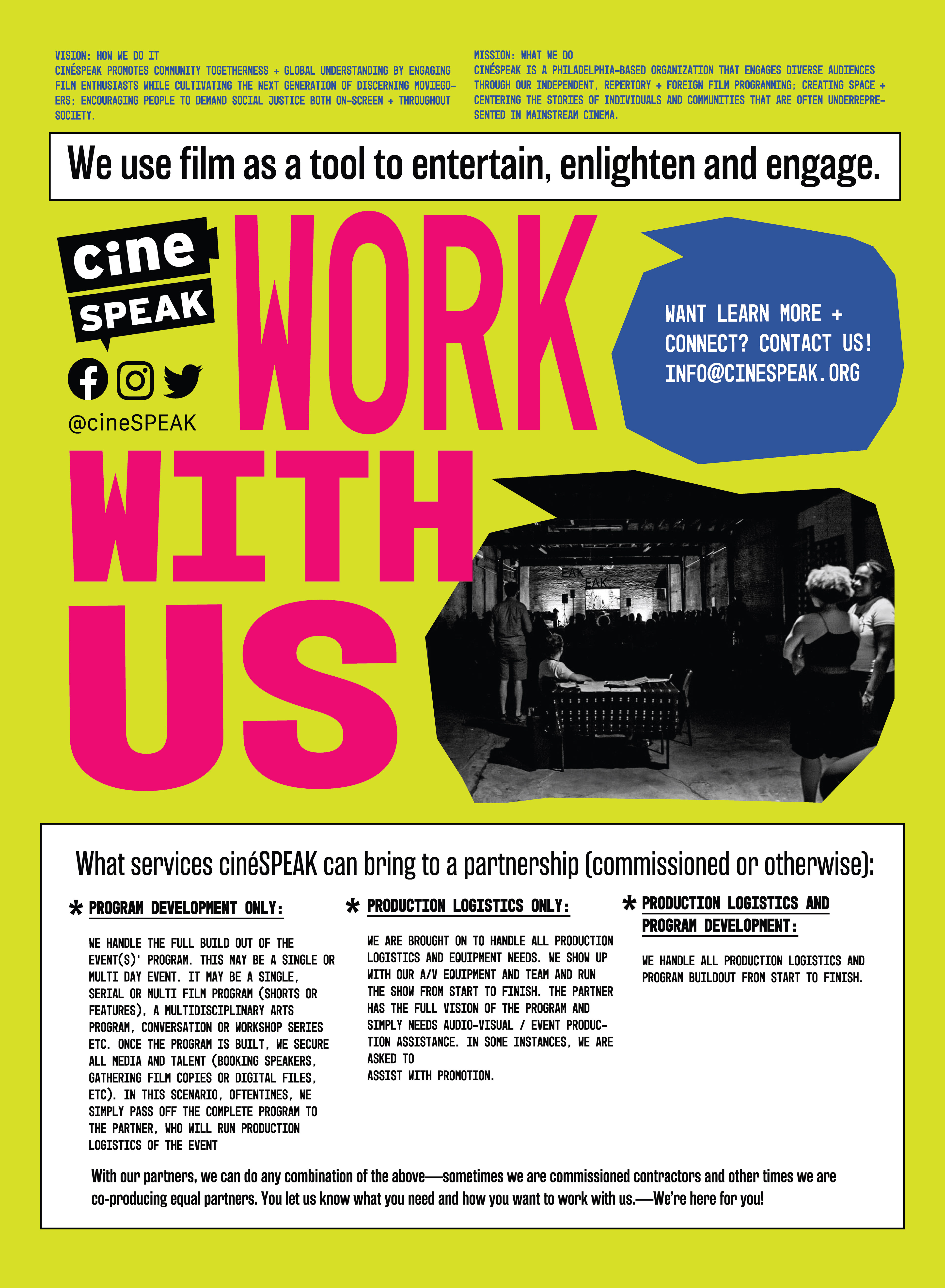
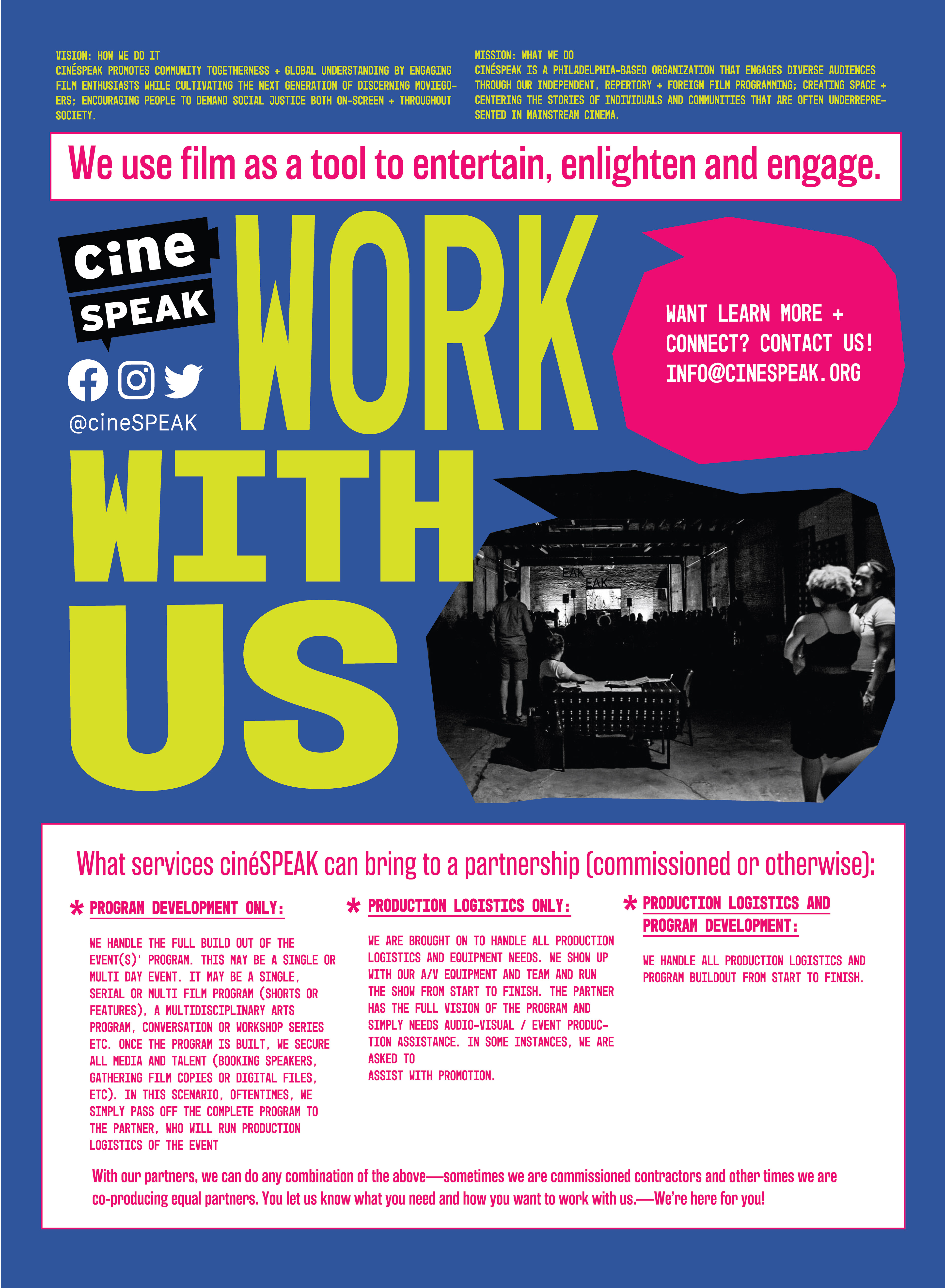
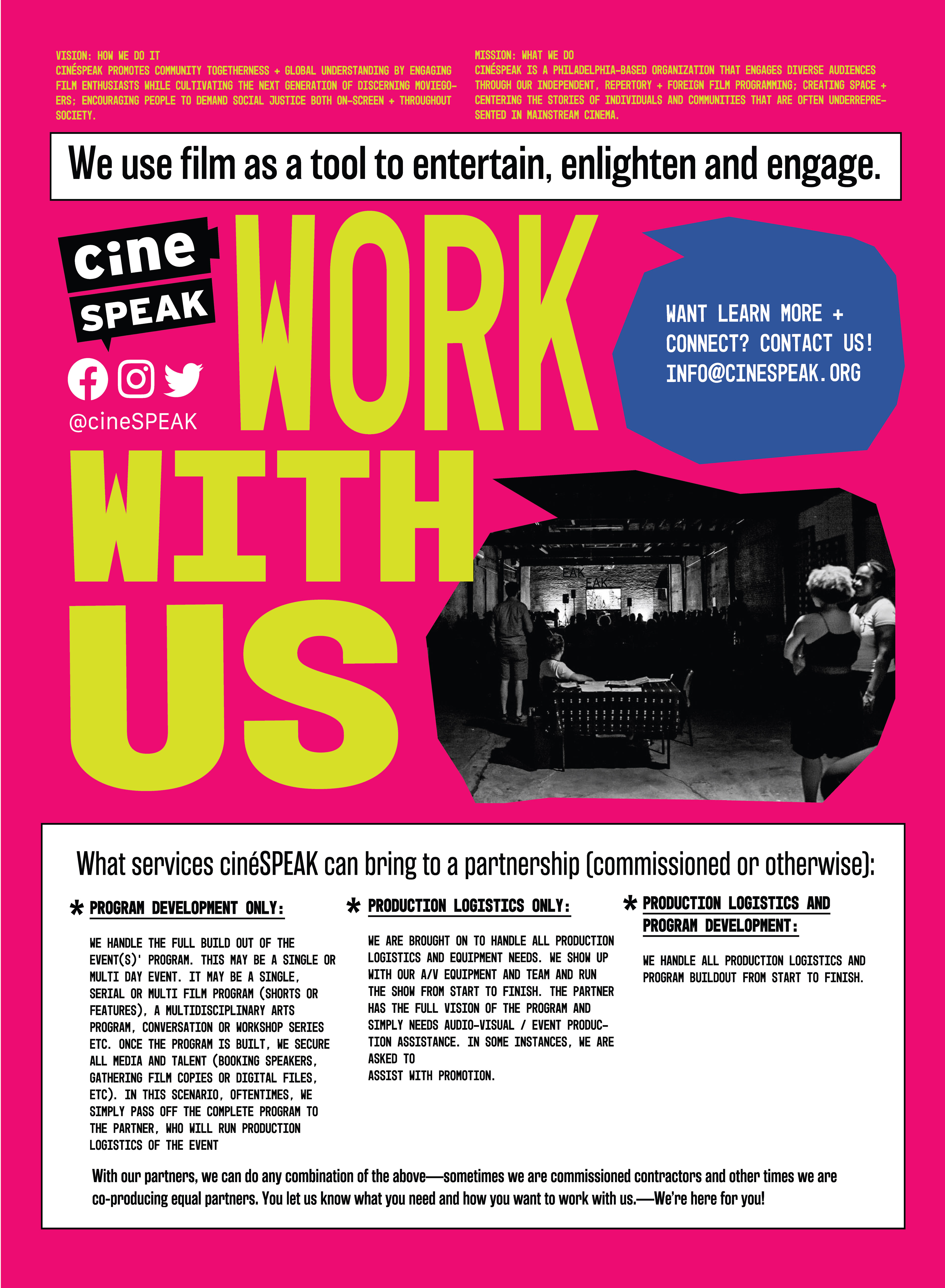
Creating promotional materials for CineSpeak a Philly based justice-centered cinema and film programming organization. The goal was to make materials that were both informative as well as demonstrative of what type organization cineSPEAK is. The designs also should be easily editable for quick changes and turn around times.
Approach
At the start of the project I asked the client if they had any brand assets that I should include in the design. They provided me with the logo a couple patterns and a loose color scheme. However, as far as the design I would complete for them I had basically had free reign. My inspiration started with the logo, it gave me a general idea of the brand attitude. I then explored their Instagram to get an idea of the tone. It felt very to the point and DIY. It immediately reminded me of the work of the Guerilla Girls, Zines, and old 80s underground hip-hop posters. The inspiration for the design all had three things in common: An anti-establishment attitude, a sense of urgency and a limited budget. Historically posters for DIY projects were limited in budget (CineSpeak included) and so I made the conscious decision to make the type the hero of the image. The ransom note / cut and paste look was what I was going for. In order to achieve this Iook I used 5 different san-serif and monotype typefaces to get a collage of similar but different text. I placed all the text in Illustrator to give me maximum flexibility for manipulation and movement. Then printed the images on colored paper in order to see what the final result would look like (ie. text size and image resolution) Once the design was finalized I moved it to InDesign in order to create a template for text edits. My work with cineSPEAK is ongoing and involves a reimagining of their flyer for every month.
Project Duration
Ongoing. Initial Project Time 2 weeks
