
High-Fidelity Prototype Visit cinespeak.org to see the live website!
Discovery
The task seems straightforward, right? Not quite. The idea of website was vague. The cinéSPEAK team already compiled a list of the website contents. I worked with 5 members of the organization leadership. The Founder & Executive Director, Managing Editor and Administrator, Production Manager, the Editor-in-Chief of cinéSPEAK journal, an online publication that supplements films with critics and community updates and the developer for the website.
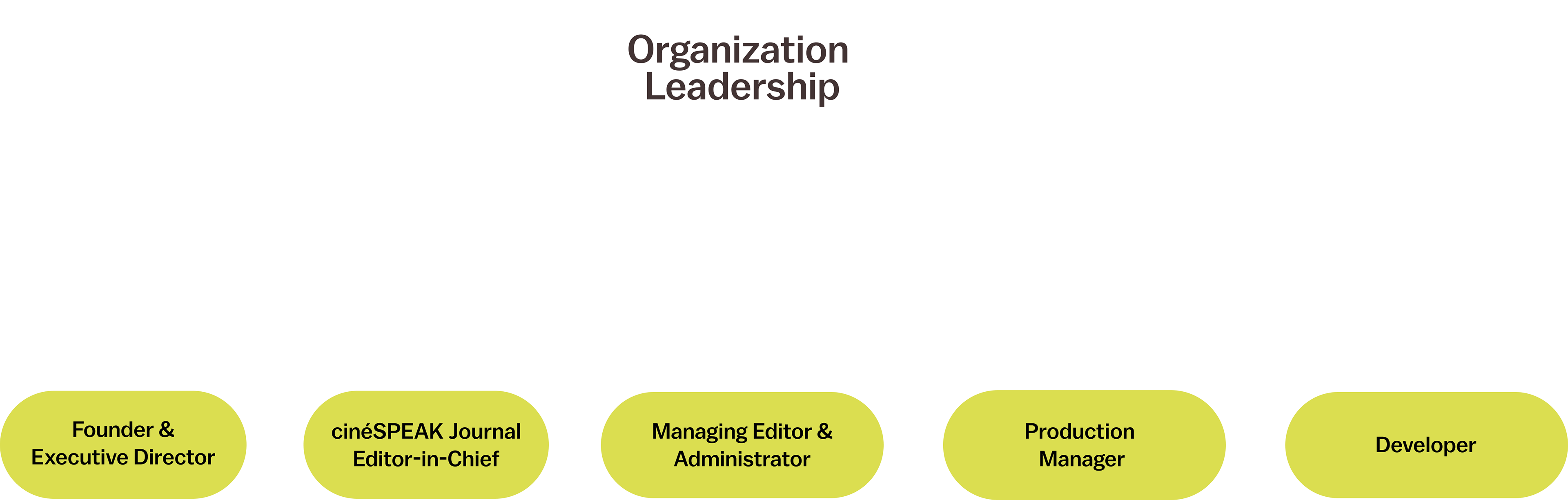
When it came to content I specifically worked with the Founder, Managing Editor and the Journal Editor-in-chief. Each had their own priorities for the needs of the site. They shared a spreadsheet that outlined each webpage and its content. I categorized each page in the list into 4 categories of content:
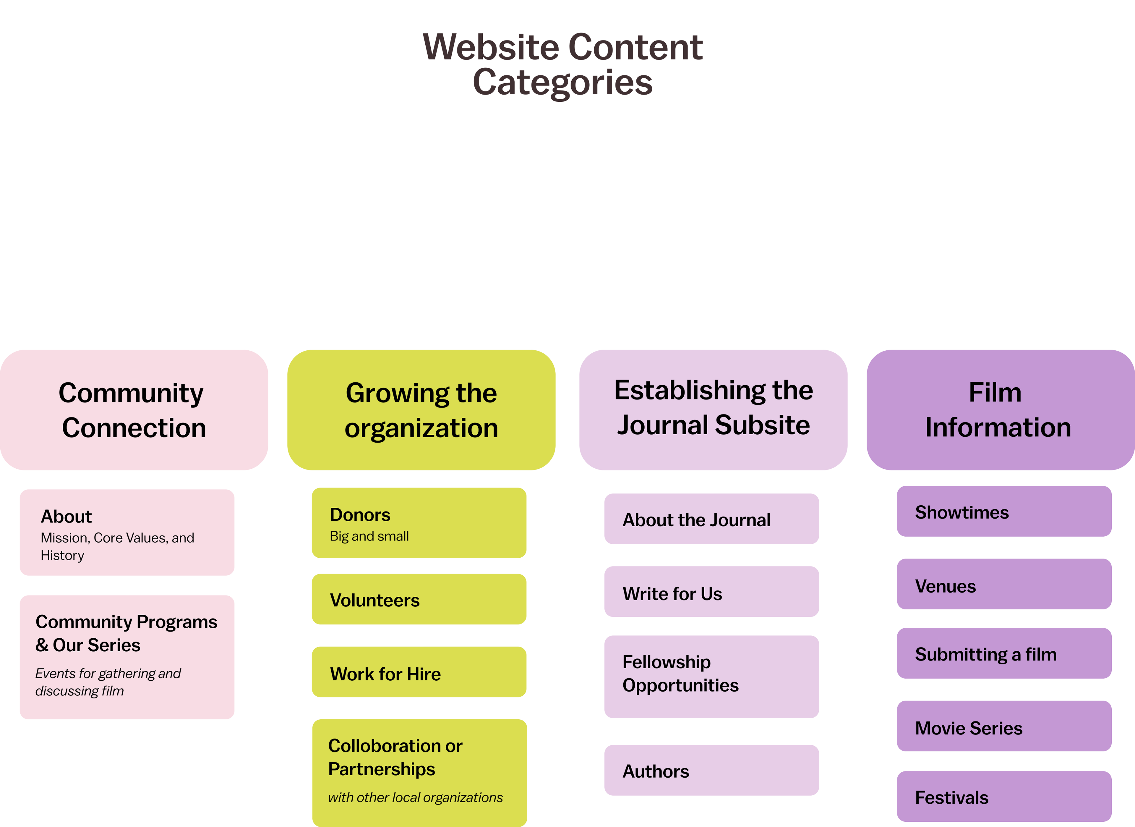
Website Map
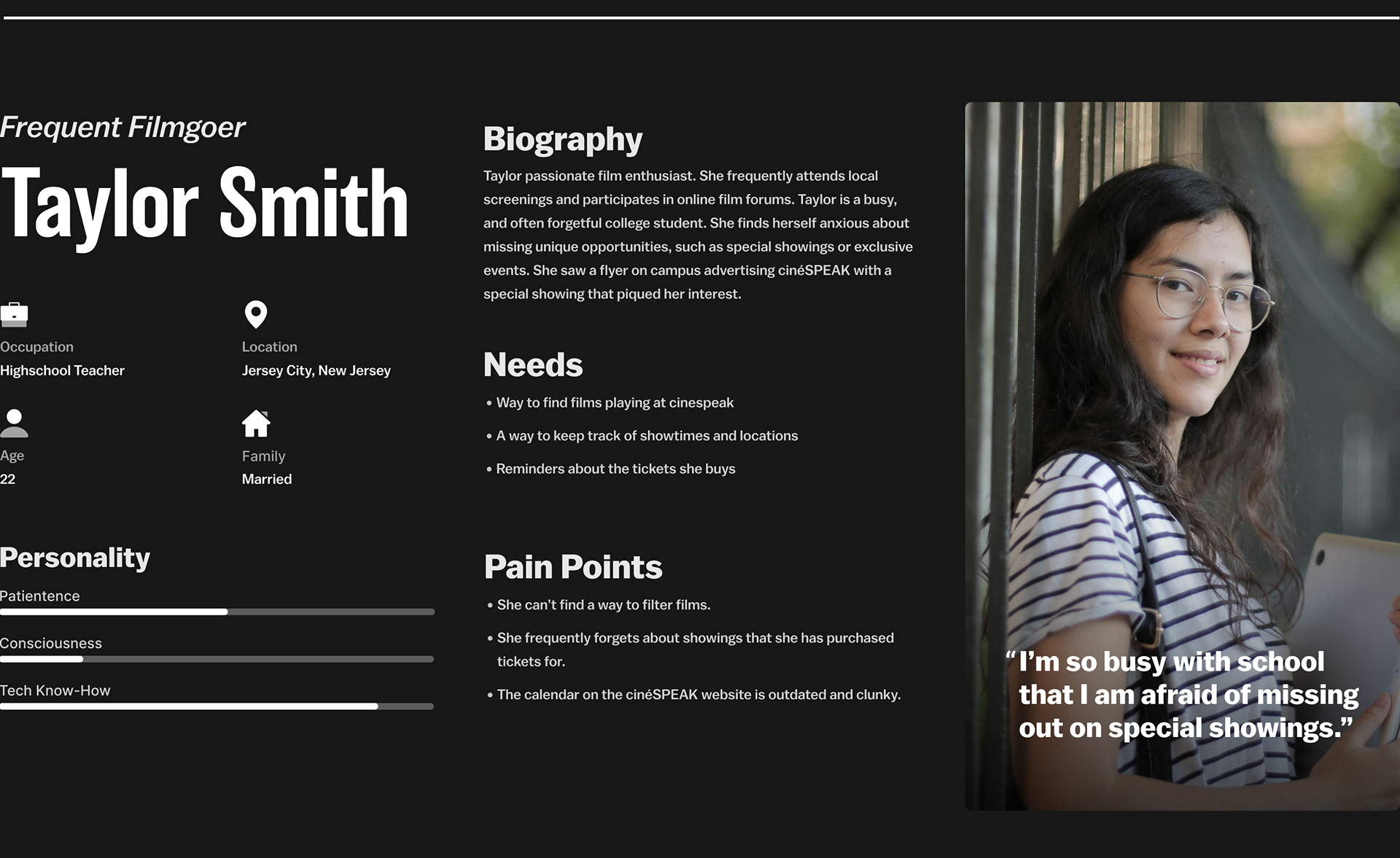
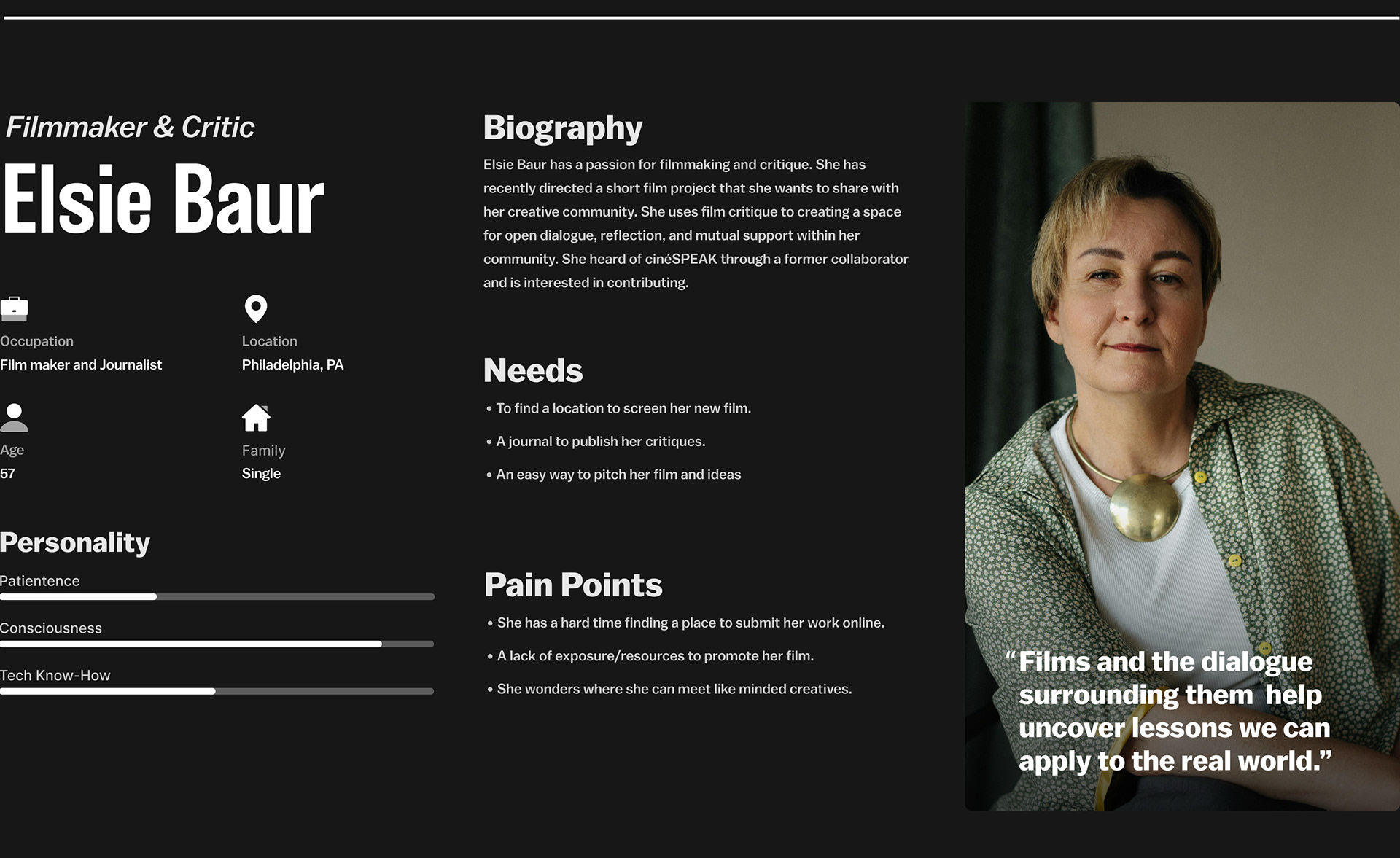
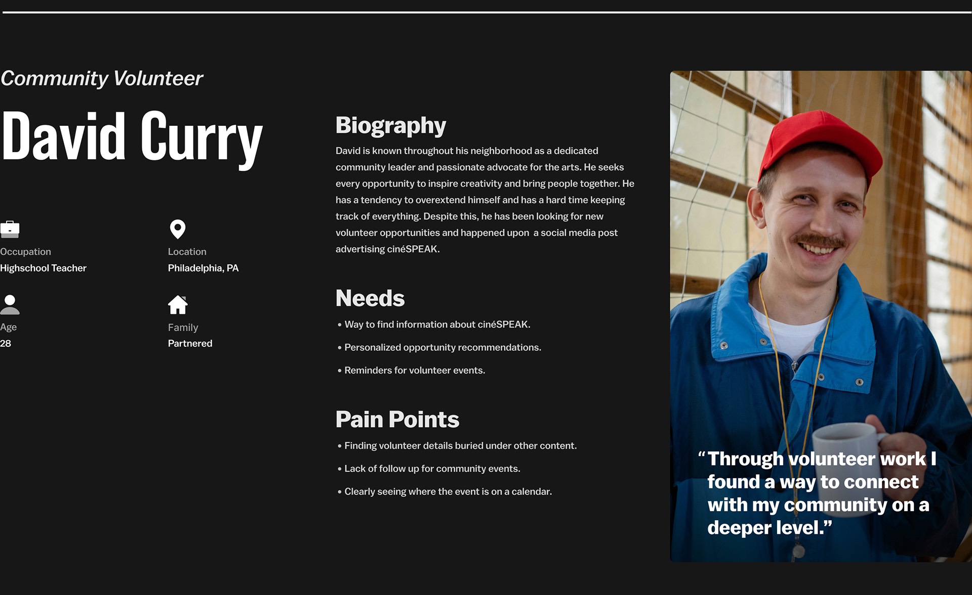
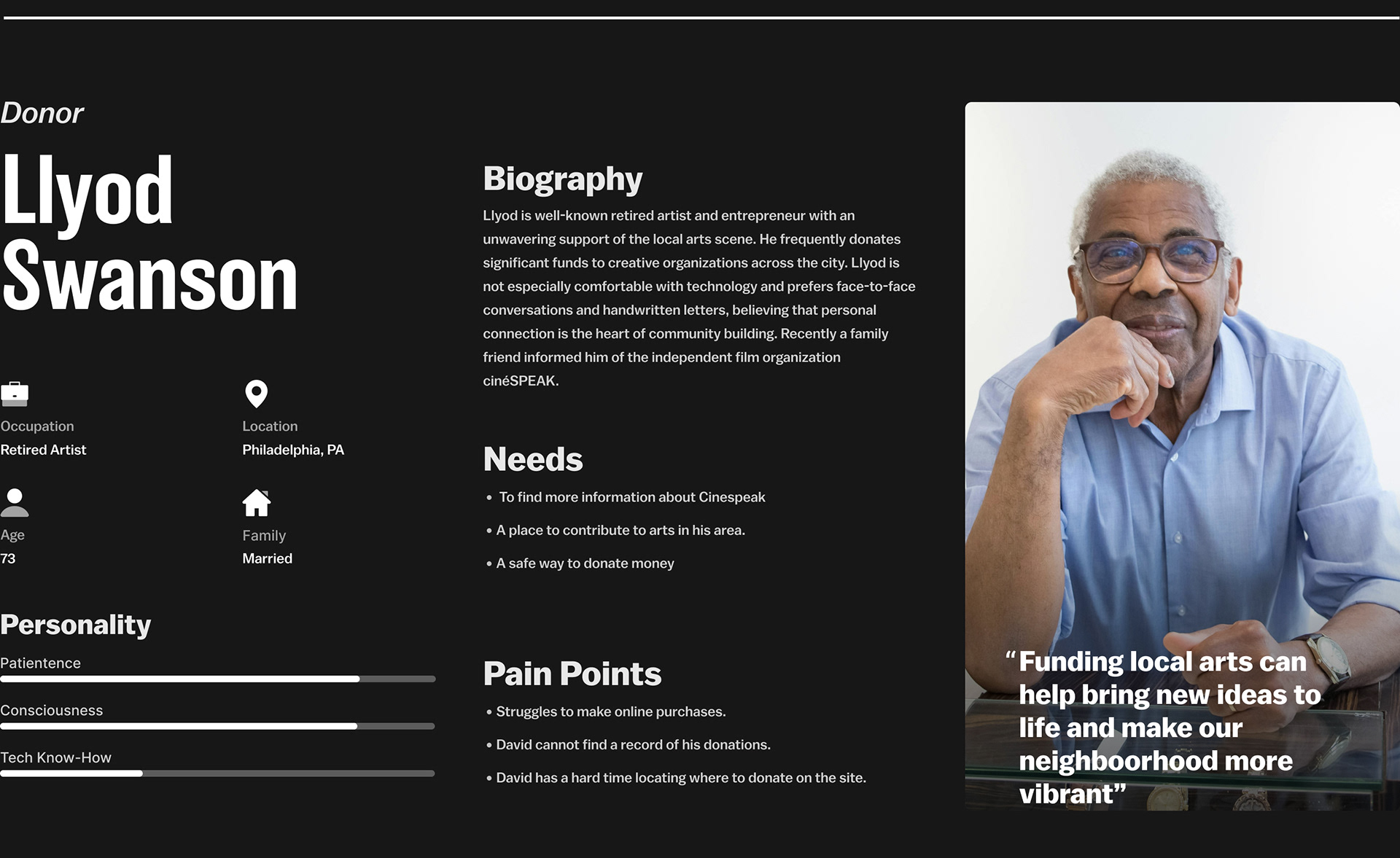
User Personas
Style Guide & Brand
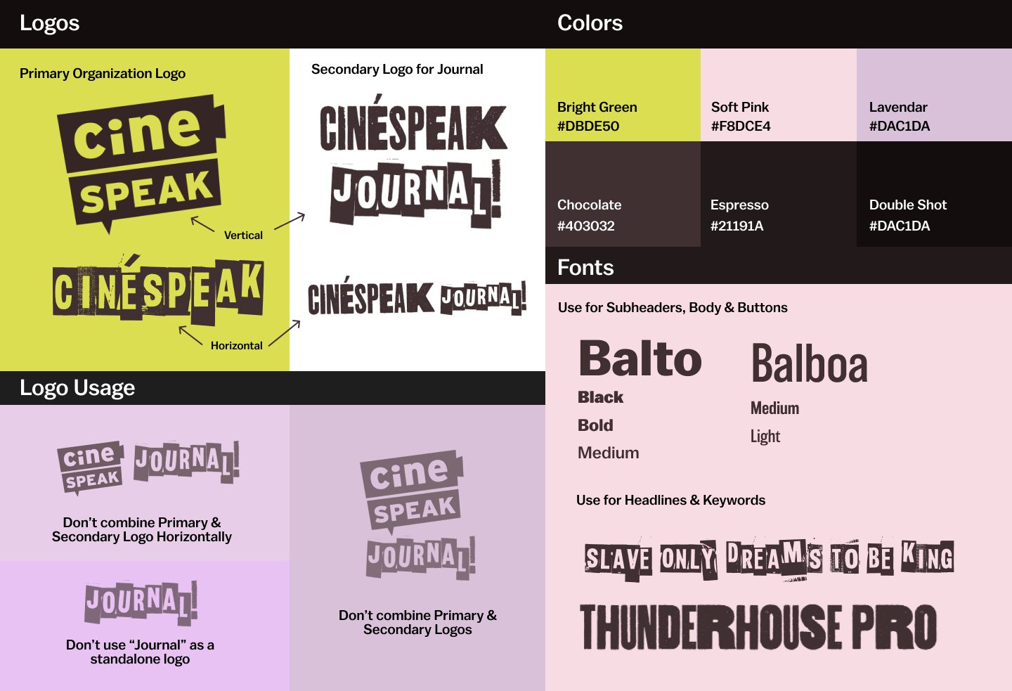
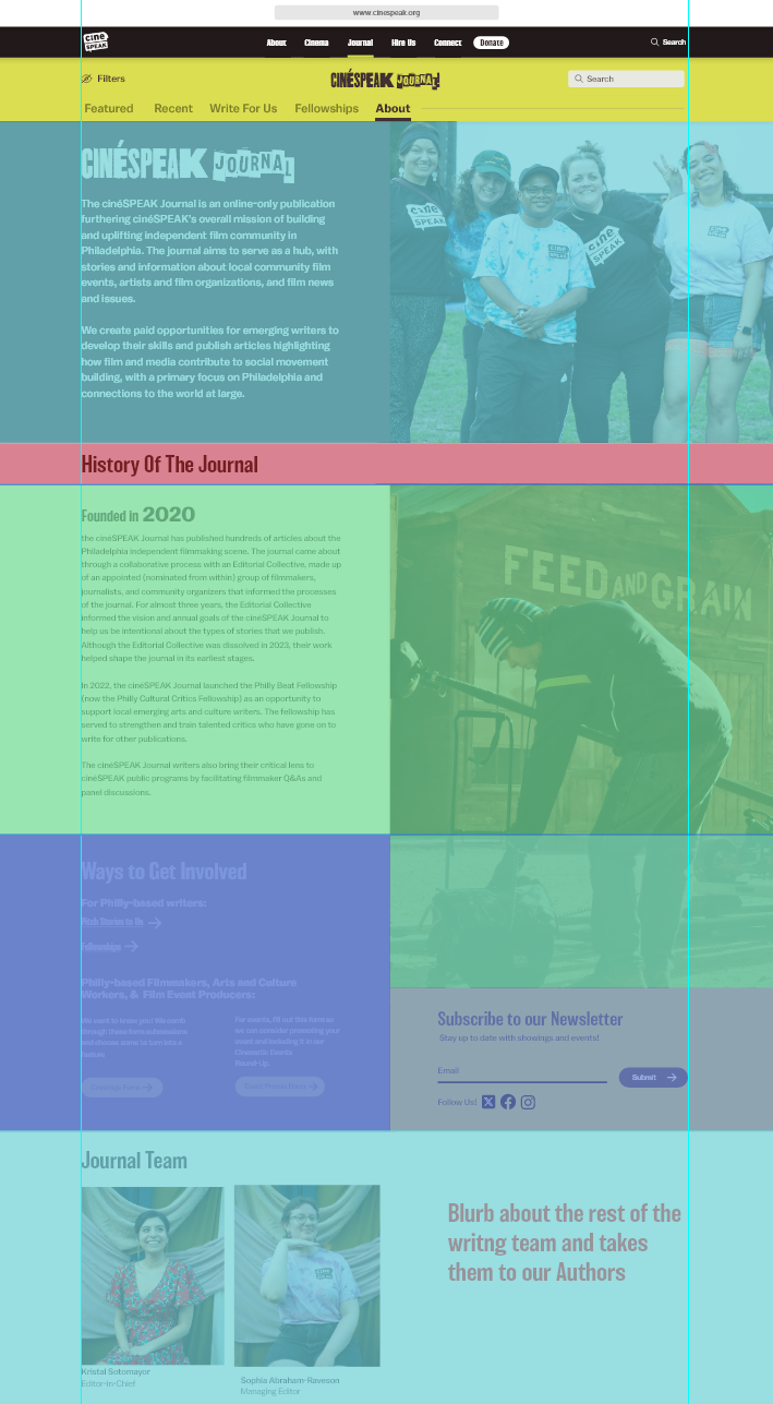
The branding of cinéSPEAK hearkens back to old posters of the 80's and 90's with the cut and paste and D.I.Y. aesthetic. This lends well to print design but could prove to be challenging to translate to web. Web design is very formatted and organized within a grid system which is in conflict with the organizations brand.
Layout and Grid
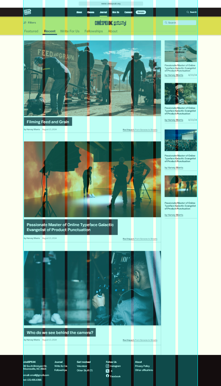
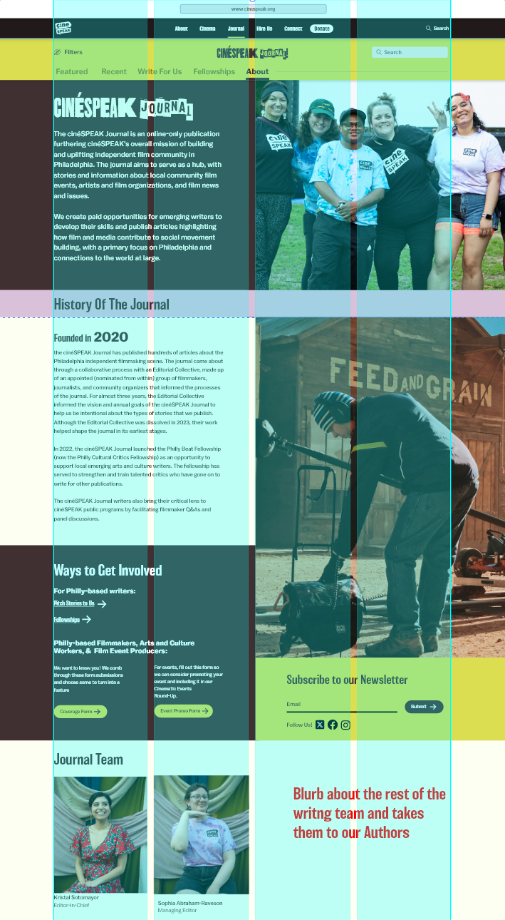
In this process I was working with a developer to take my high-fidelity prototypes and make them a reality. I remained conscious of the limits and potential challenges that can come with coding so I chose to do a layout that could translate well and be reused on a variety of pages. I achieved this with color blocking and typography. The basic "bones" of each page consisted of a color block with text and an image either to the left or right of the text box.
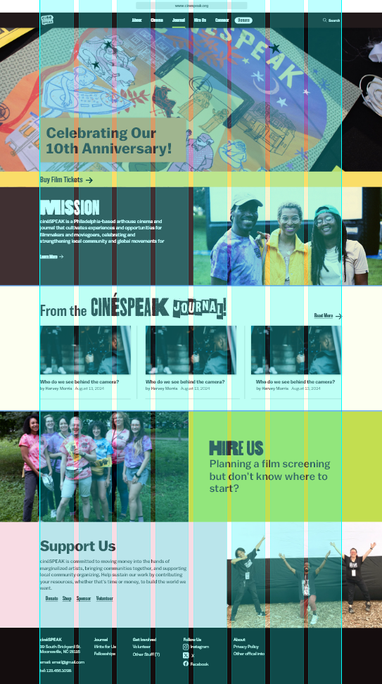
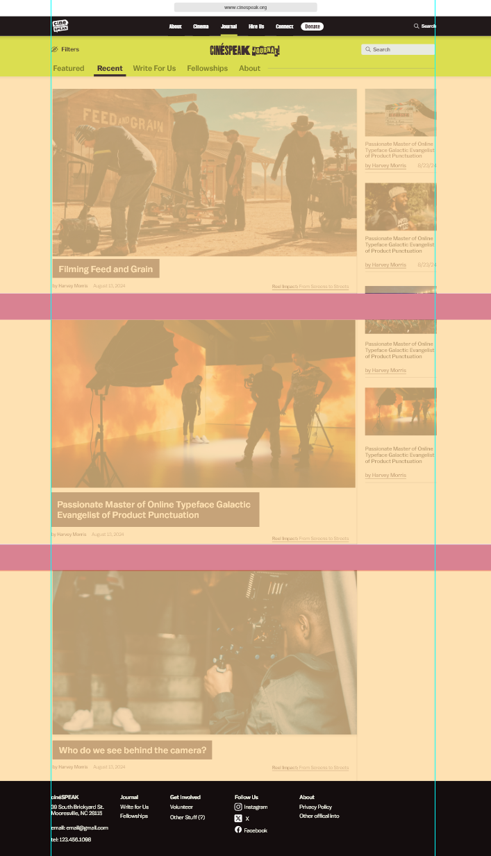
8 or 4 Columns depending on page content.
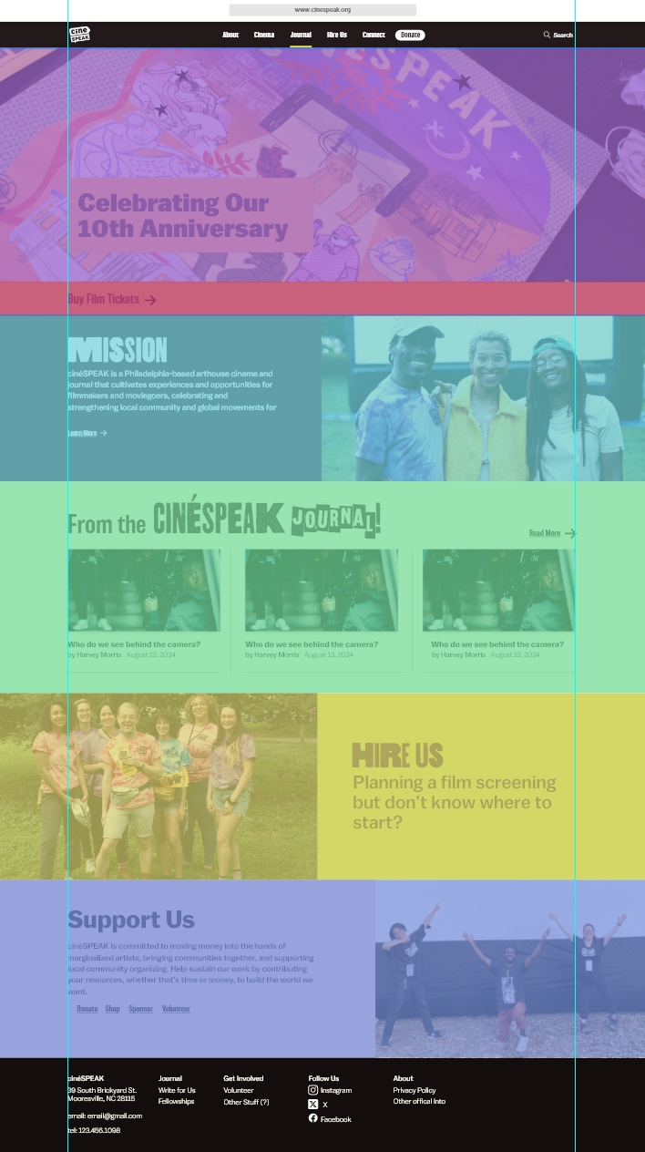
Distinct blocks to house related content. Occasionally the blocks are bisected.