
The main pain points of the initial website were the redundant buttons and unclear areas for login and sign up. In addition, there were issues with showing the user the difference between their service that is linked with the users cable service and the service that is from HBO themselves. The final pain point was that Czech users were wary of using their credit card online. It was my task to seek solutions to the aforementioned issues.
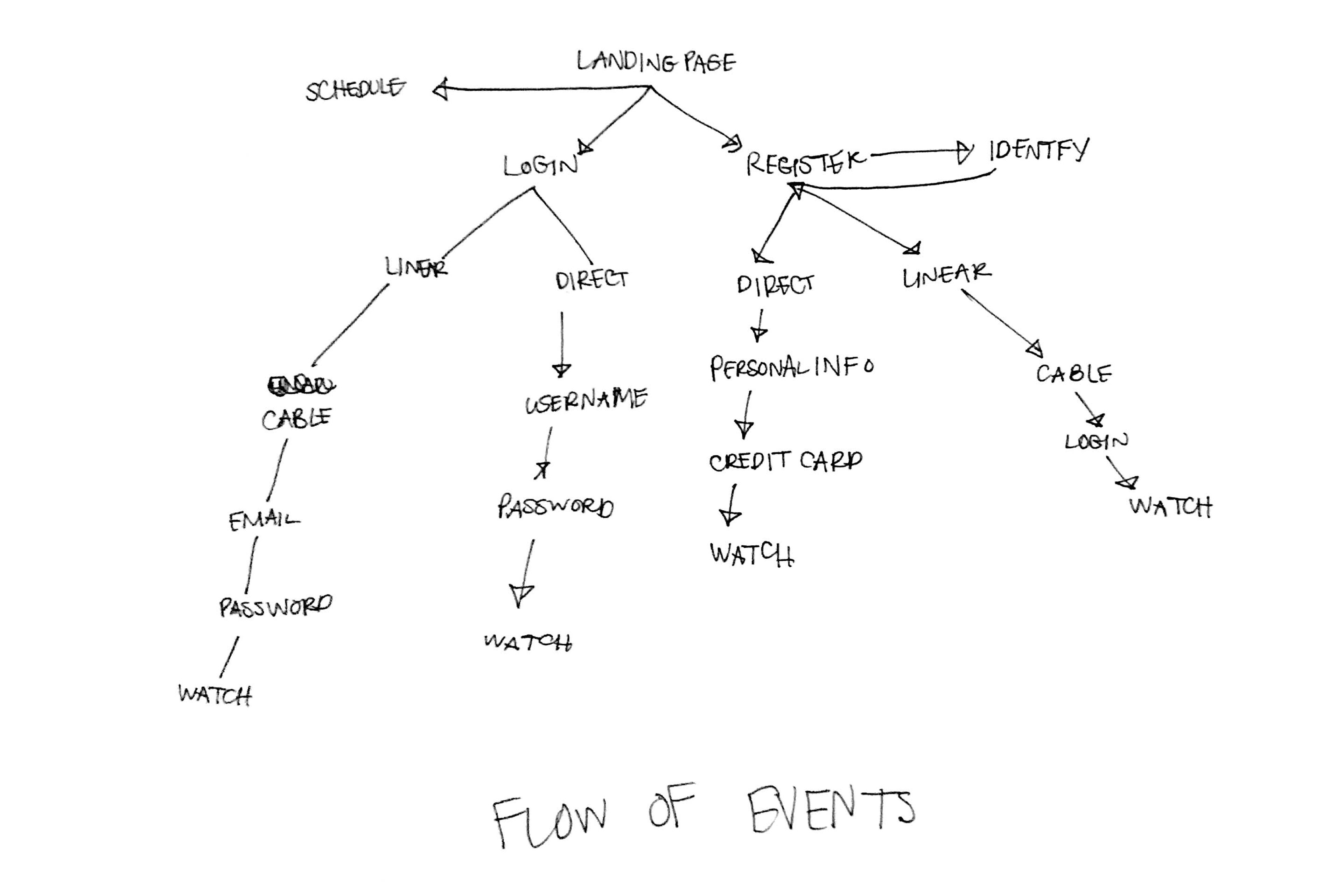
When redesigning the website login and registration the first thing I did was draw out the flow of events so I could understand how many step and directions the login and sign up process could potentially take. The flow of events were also useful in discerning how many screens were necessary. I put certain page links together simplify the process.
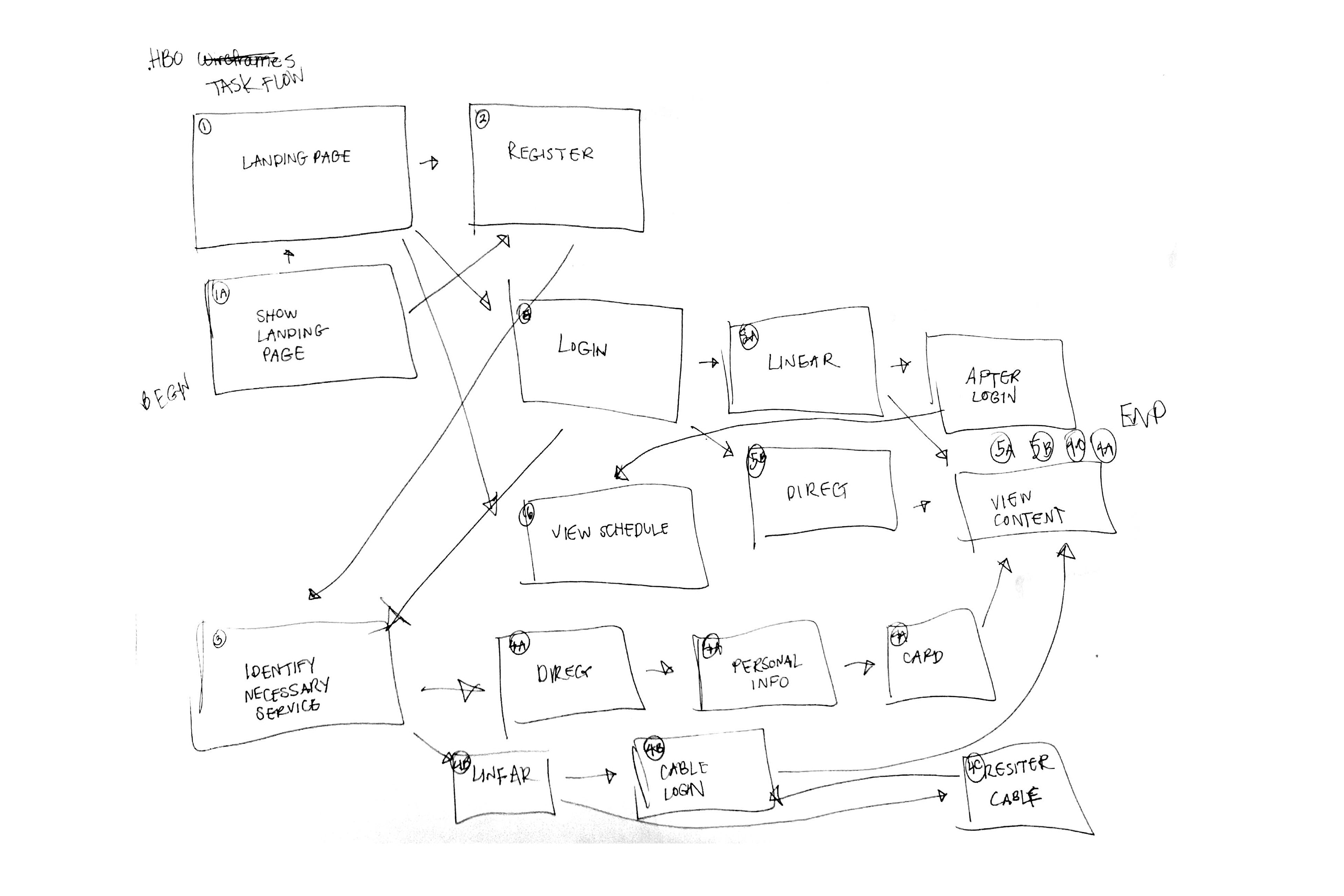
After understanding how the flow of events would play out it was time to draw which pages would connect to one another. I paid special attention to what would happen if someone was going to the website for different purposes. I wanted to make it as easy and painless as possible for the consumer.
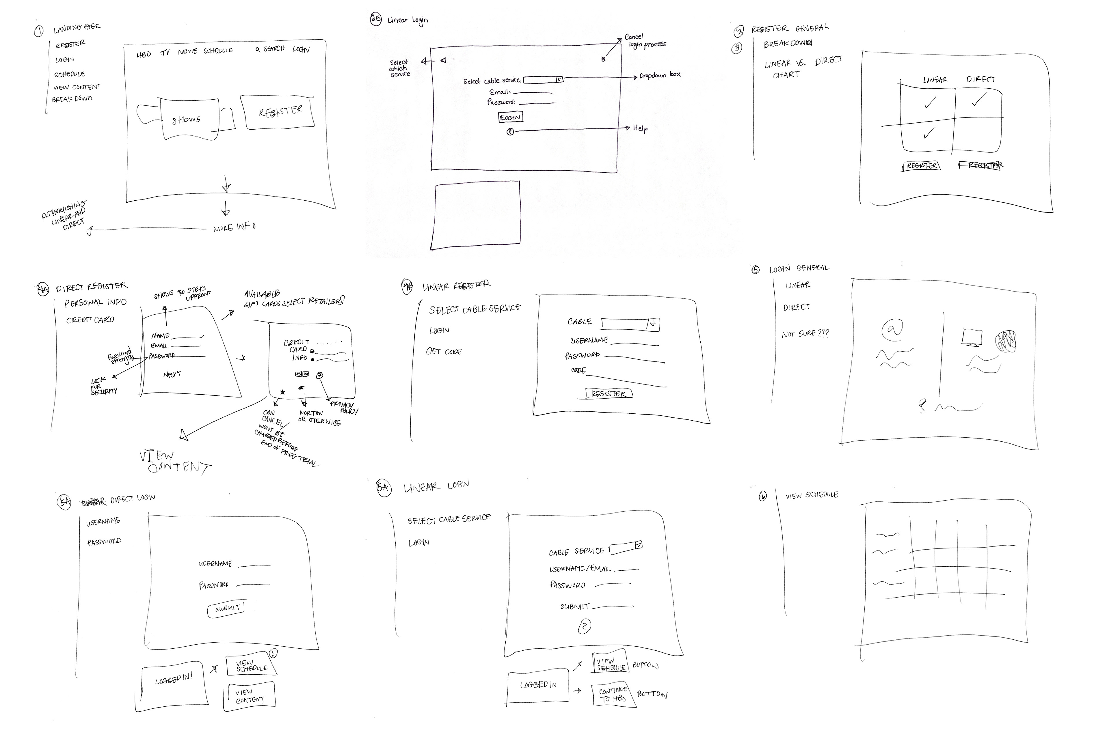
I then sketched out each individual screen that I would include in the demo. The drawings above have numbers in the corners that correspond with the task flow image above. I honed in on each individual screen for specific tasks that they each had to accomplish.
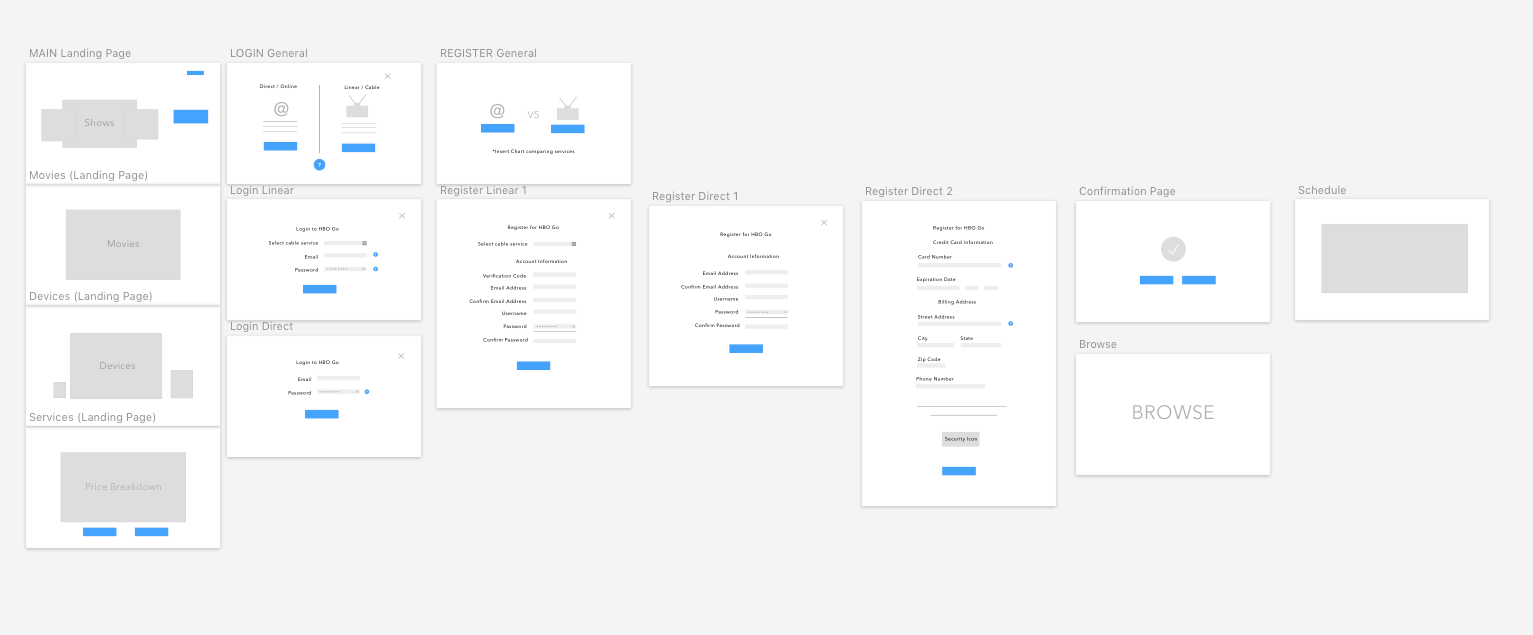
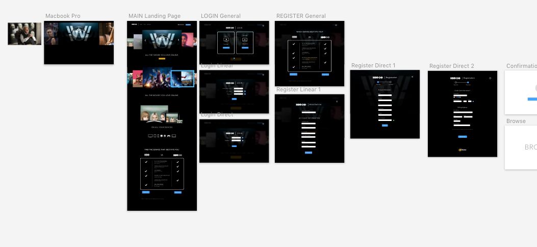
Using Principle I created lo-fi wire frames of each of the screens in order to get a general idea of layout and screen sequences.
The last part of creating the website was skinning and linking buttons to create animations. I also did some work in After Effects to create the splash screen and then embedded it into the Principle document.
In the future:
I would tighten up my animations and see how this system could be applied to other parts of HBO such as content browsing and advertising.