
About MiSDU
Parent/Guardians and employers use this website to pay child support or set up account drafting from their employees paycheck. The current website was cumbersome to use and outdated. I gave the portal a facelift and incorporated quality of life changes. I created a reposonsive design so the site could be used on mobile devices.
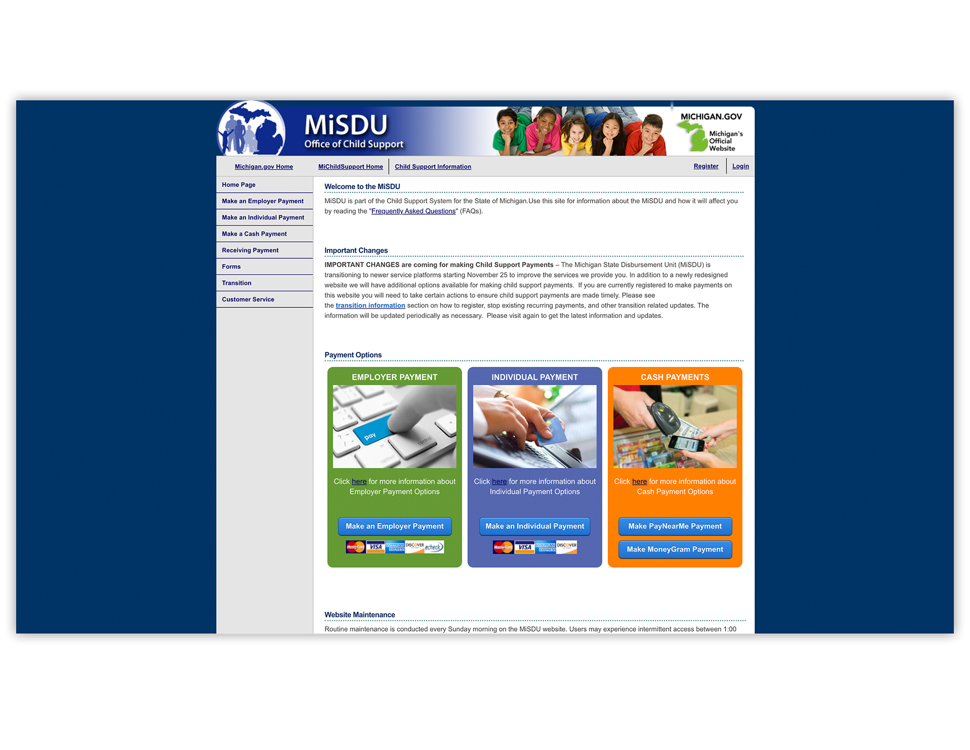
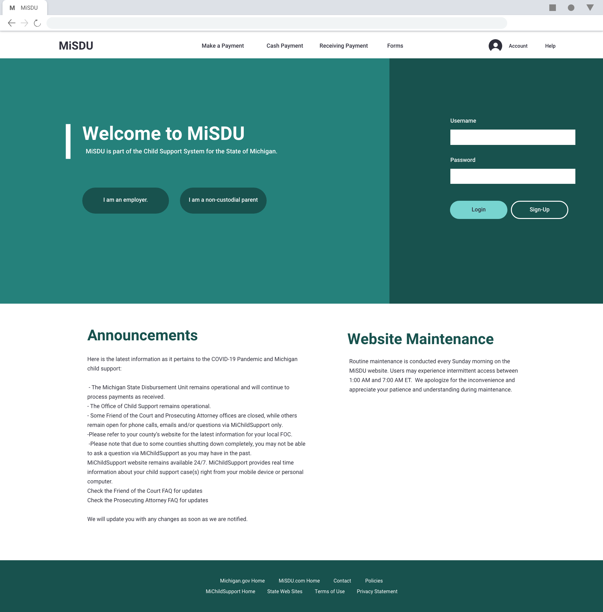
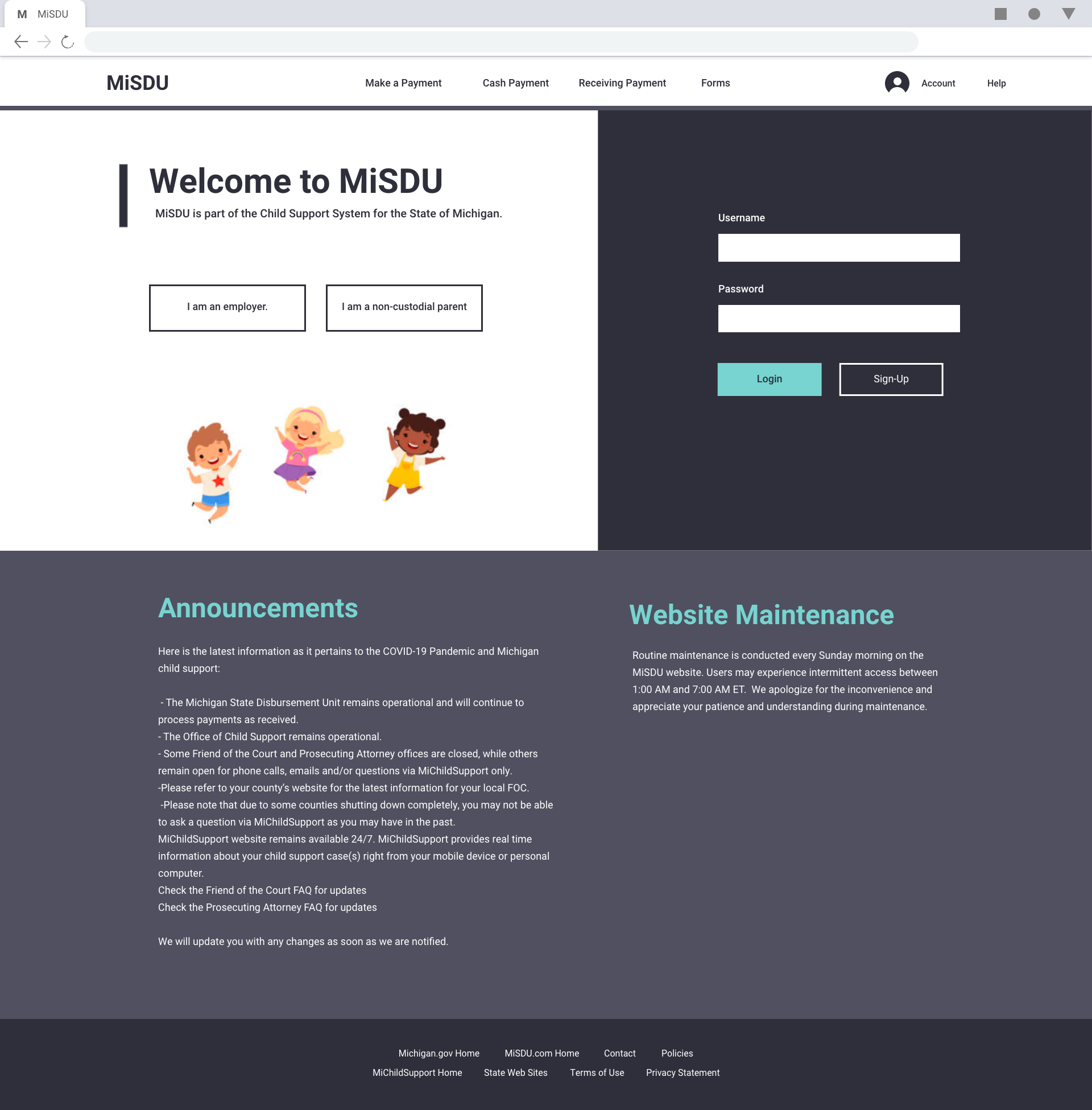
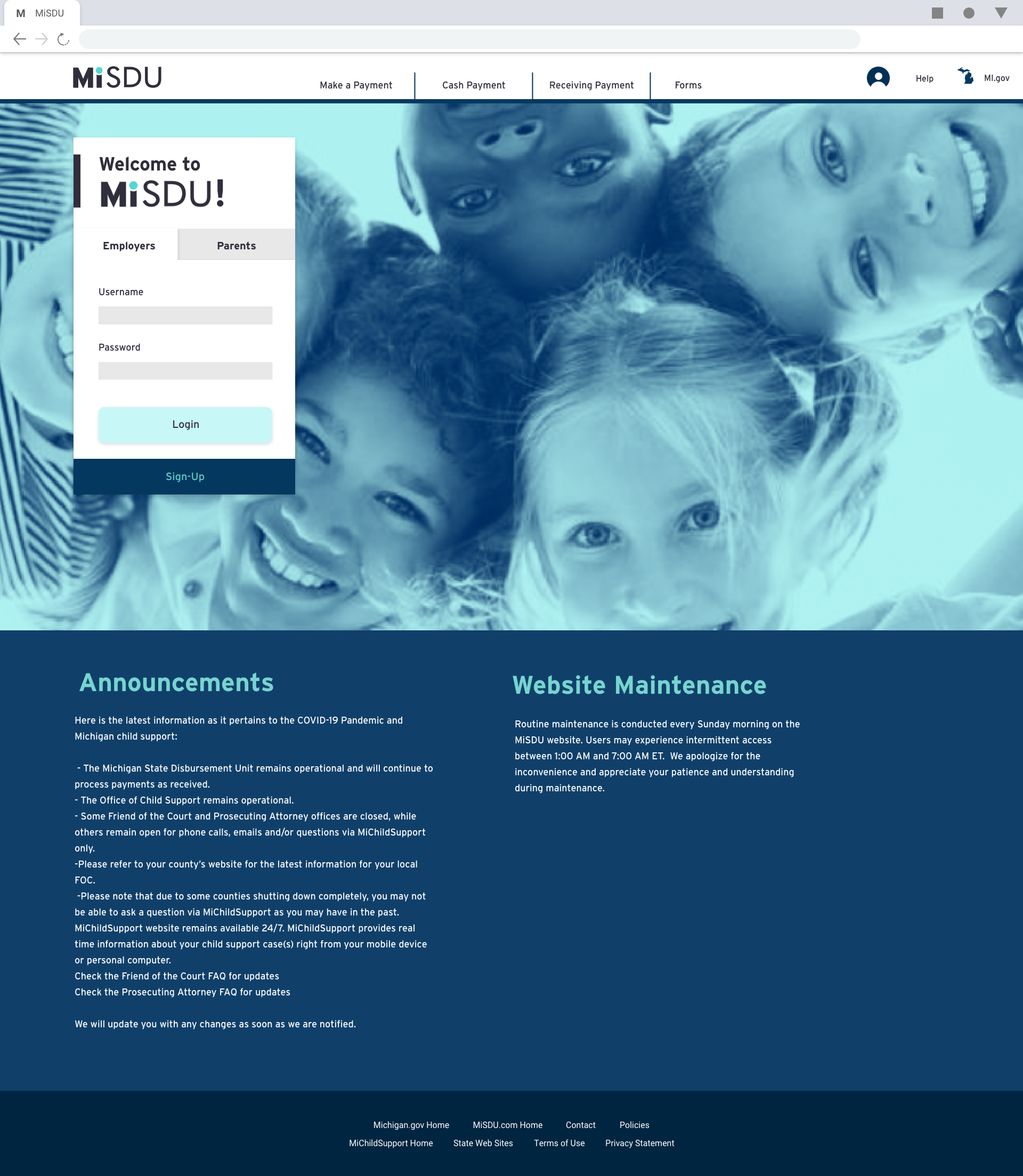
Before Redesign

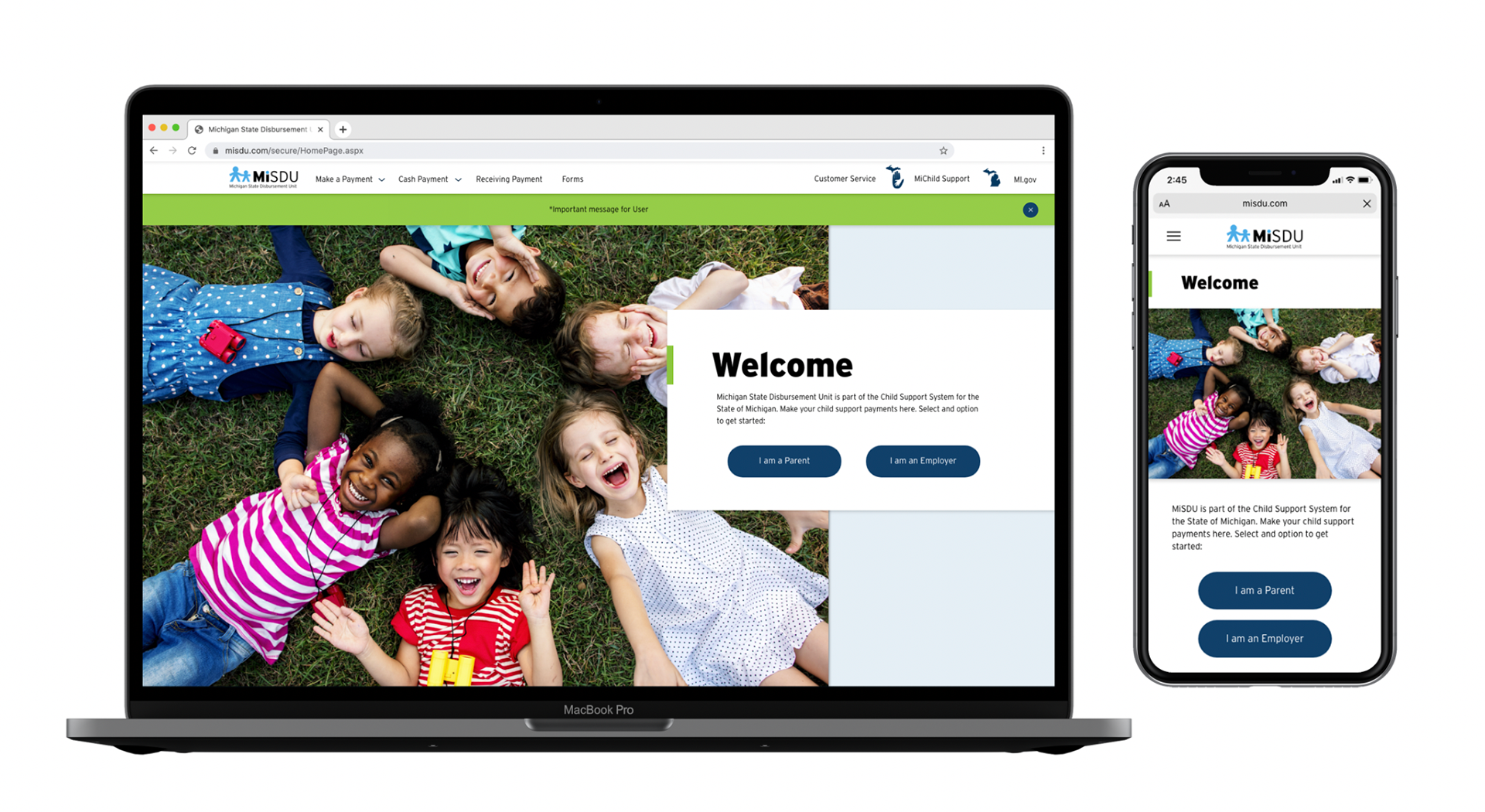
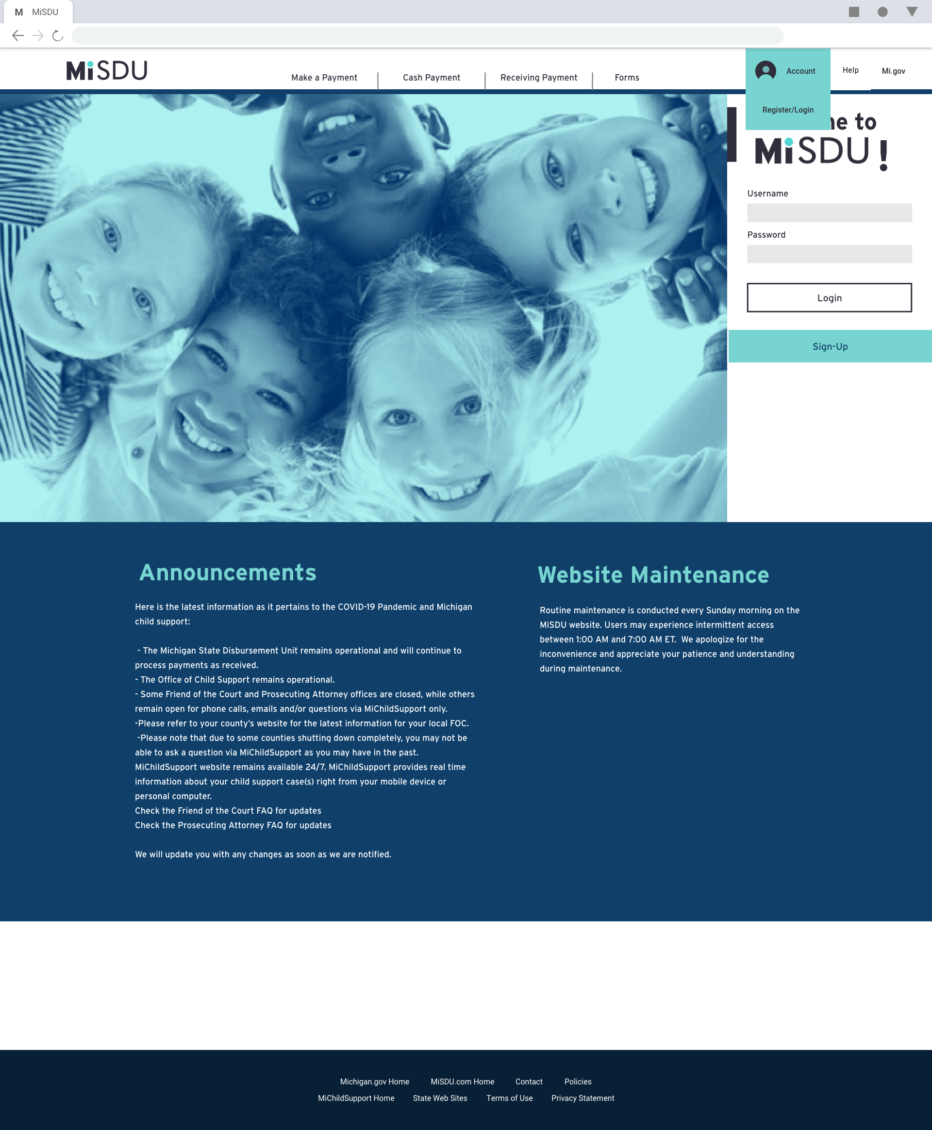
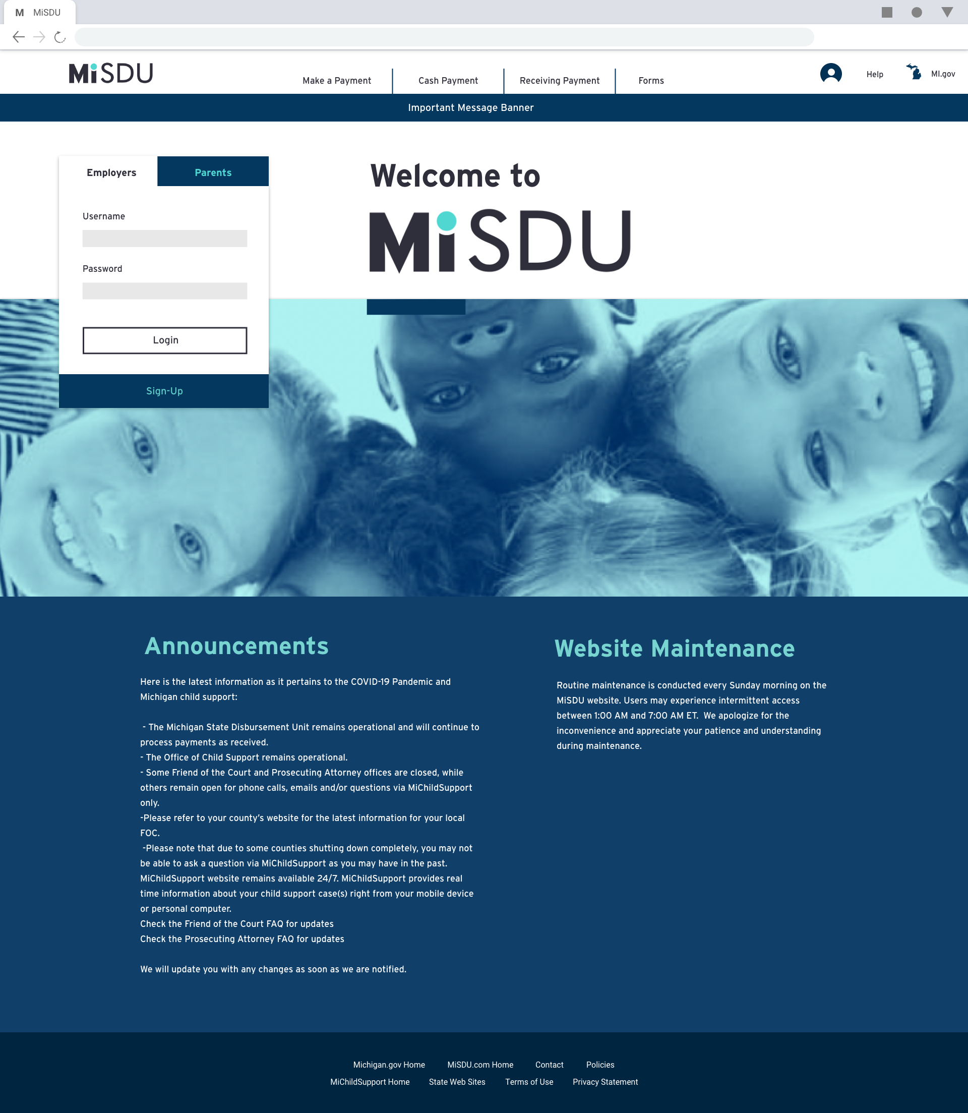
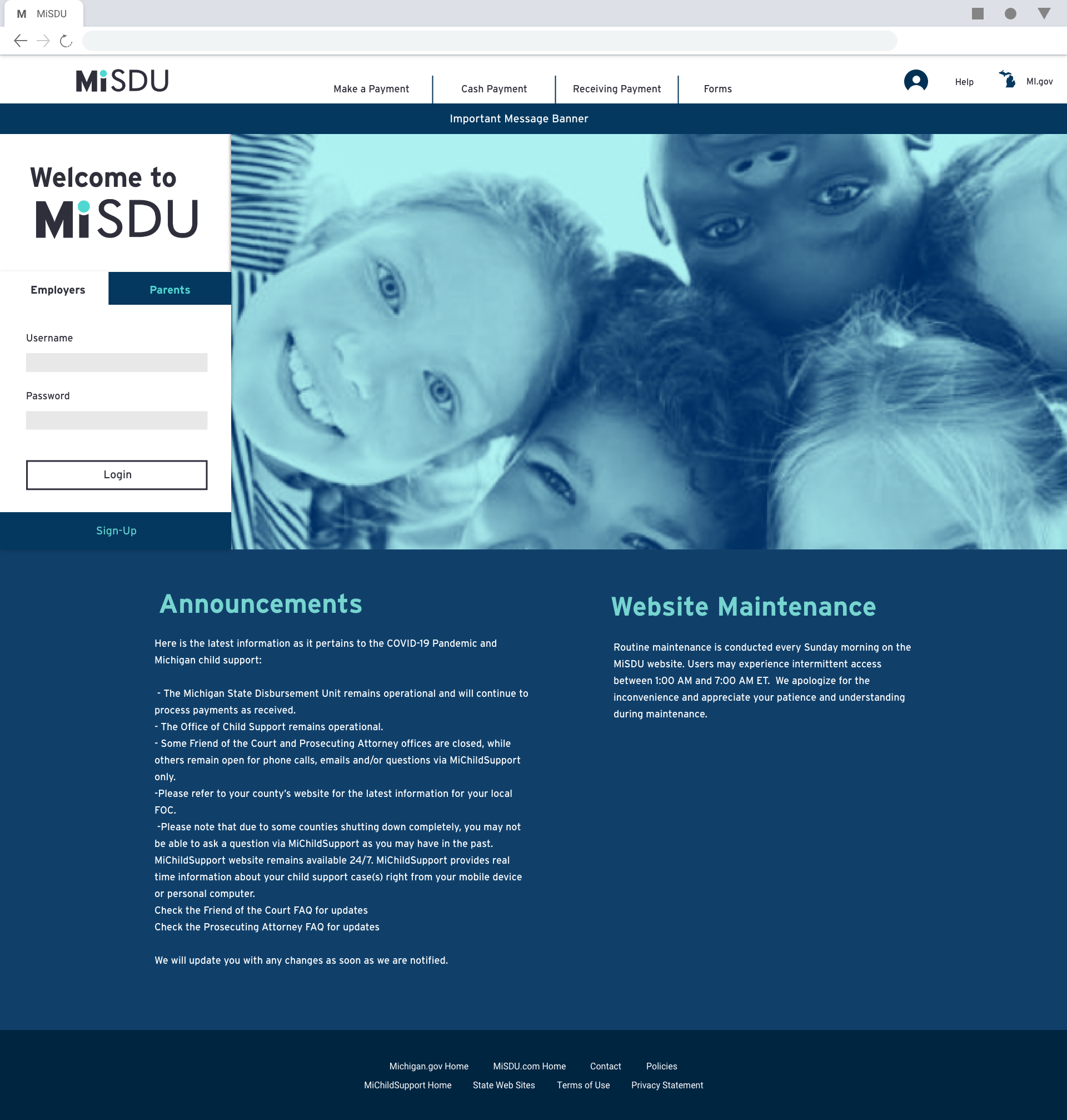
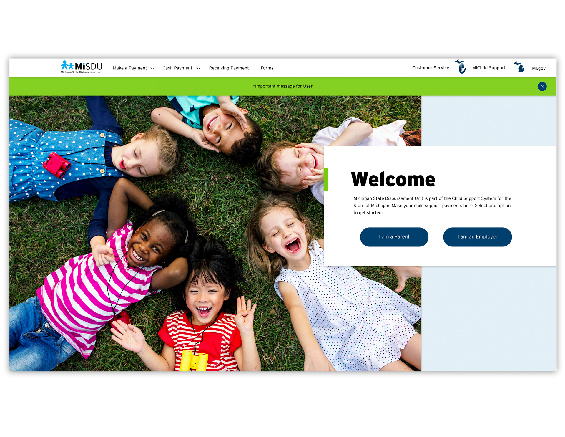
After Redesign
Content Analysis
The first step was to look at the current website and take an inventory of all the content. I mapped the content to understand the current flow of the website and identify areas of redundancy and confusion for the current user. Then I reorganized all the content in a more optimized and natural user flow.
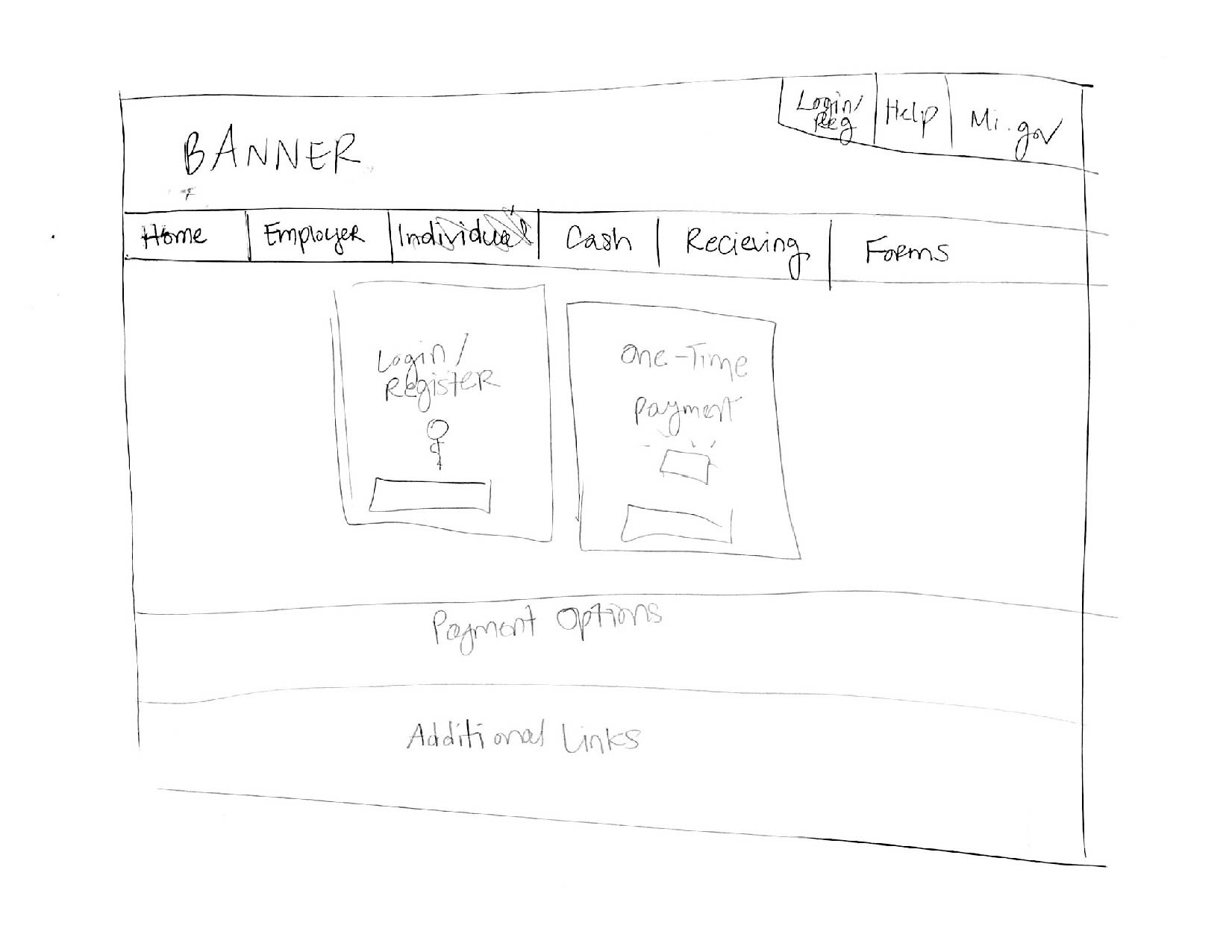
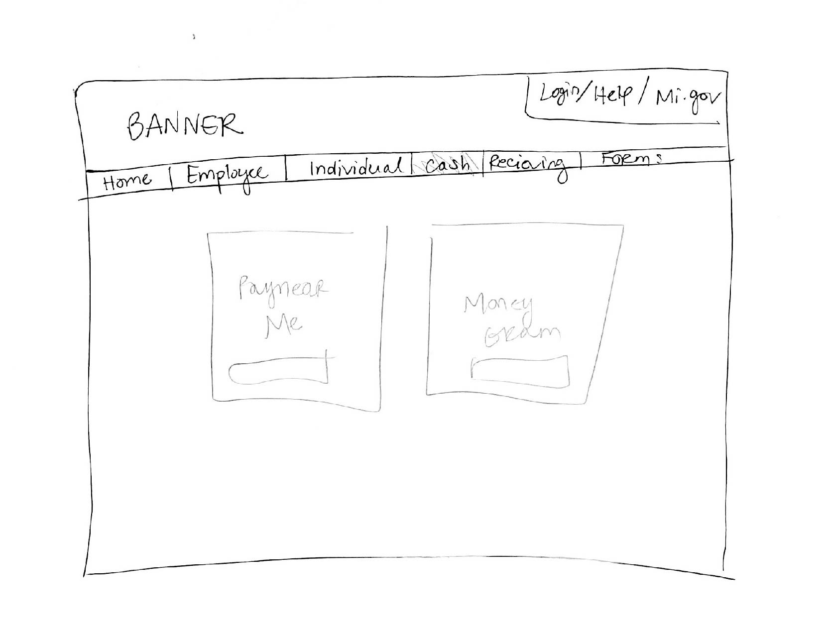
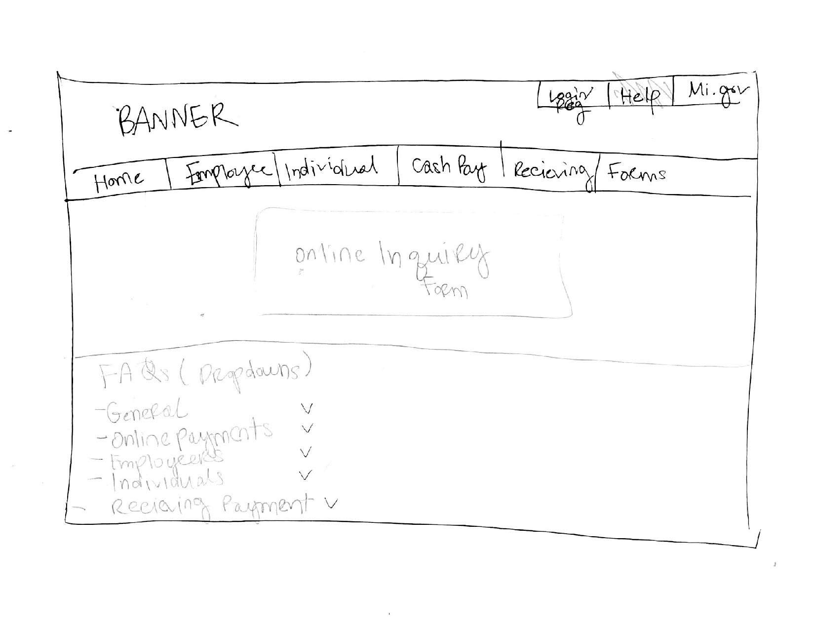
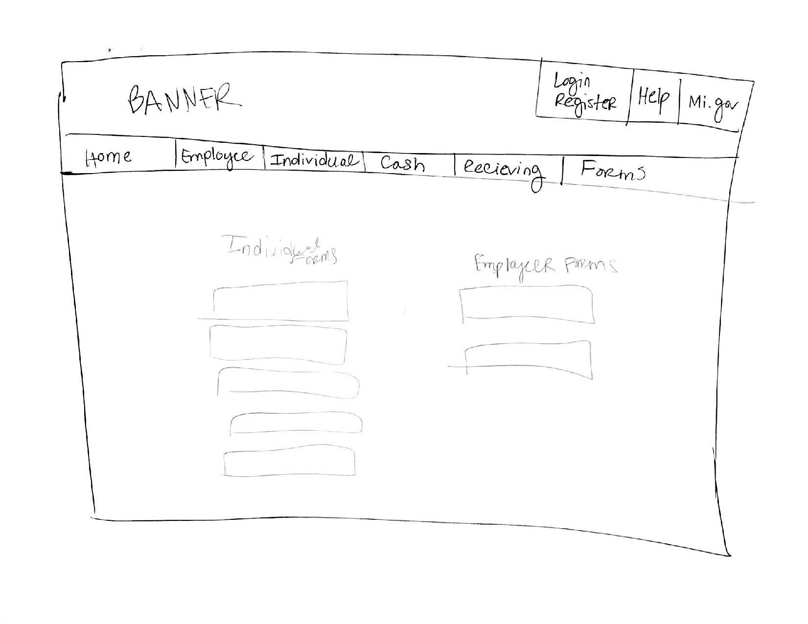
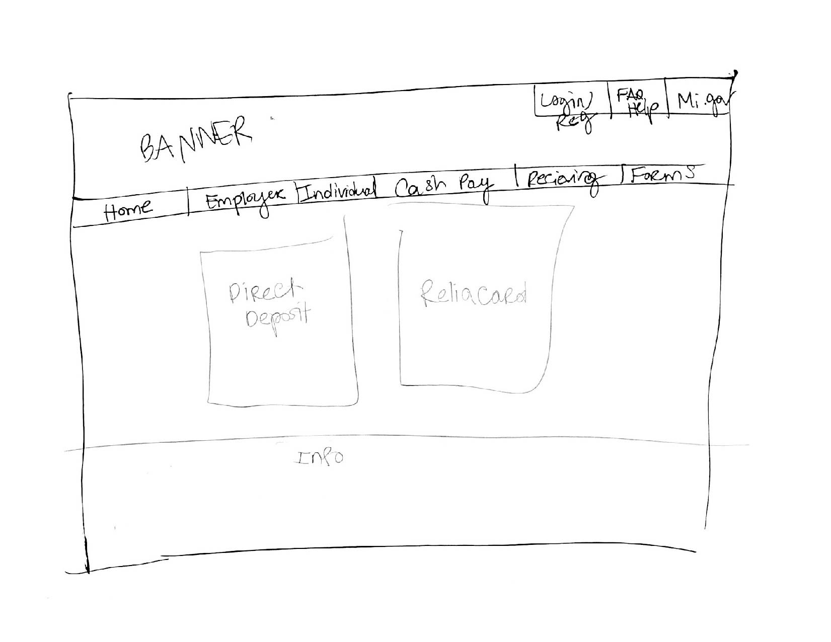
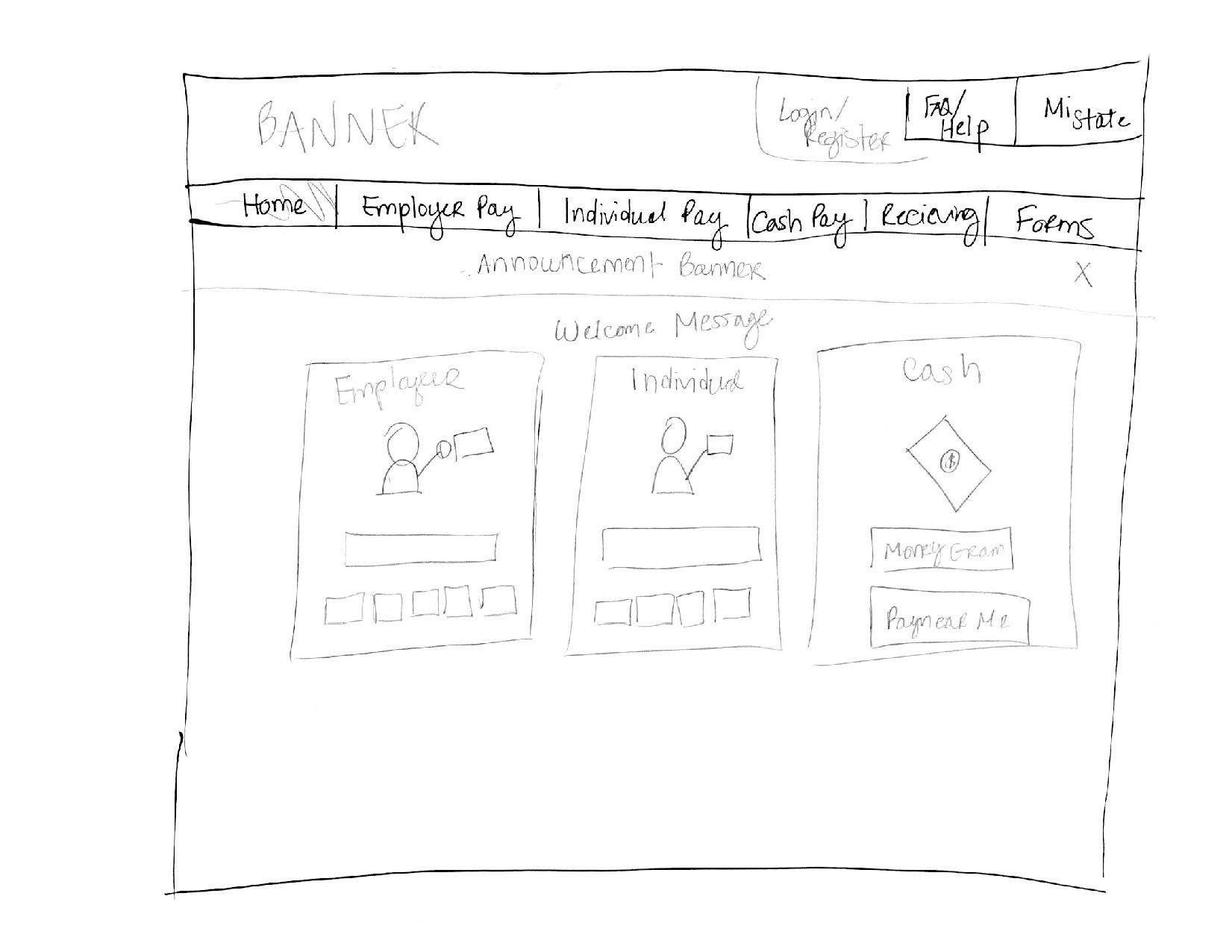
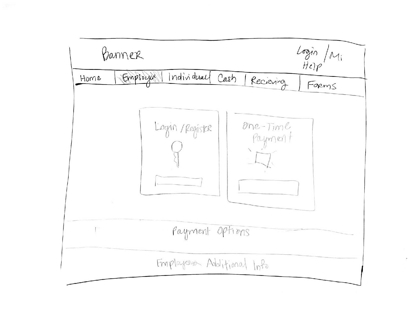
Next I sketched the main screens of the dashboards to get a basic understanding of how the flow would inform the design and then I translated the sketches into Adobe XD.
Wireframes + User Flow
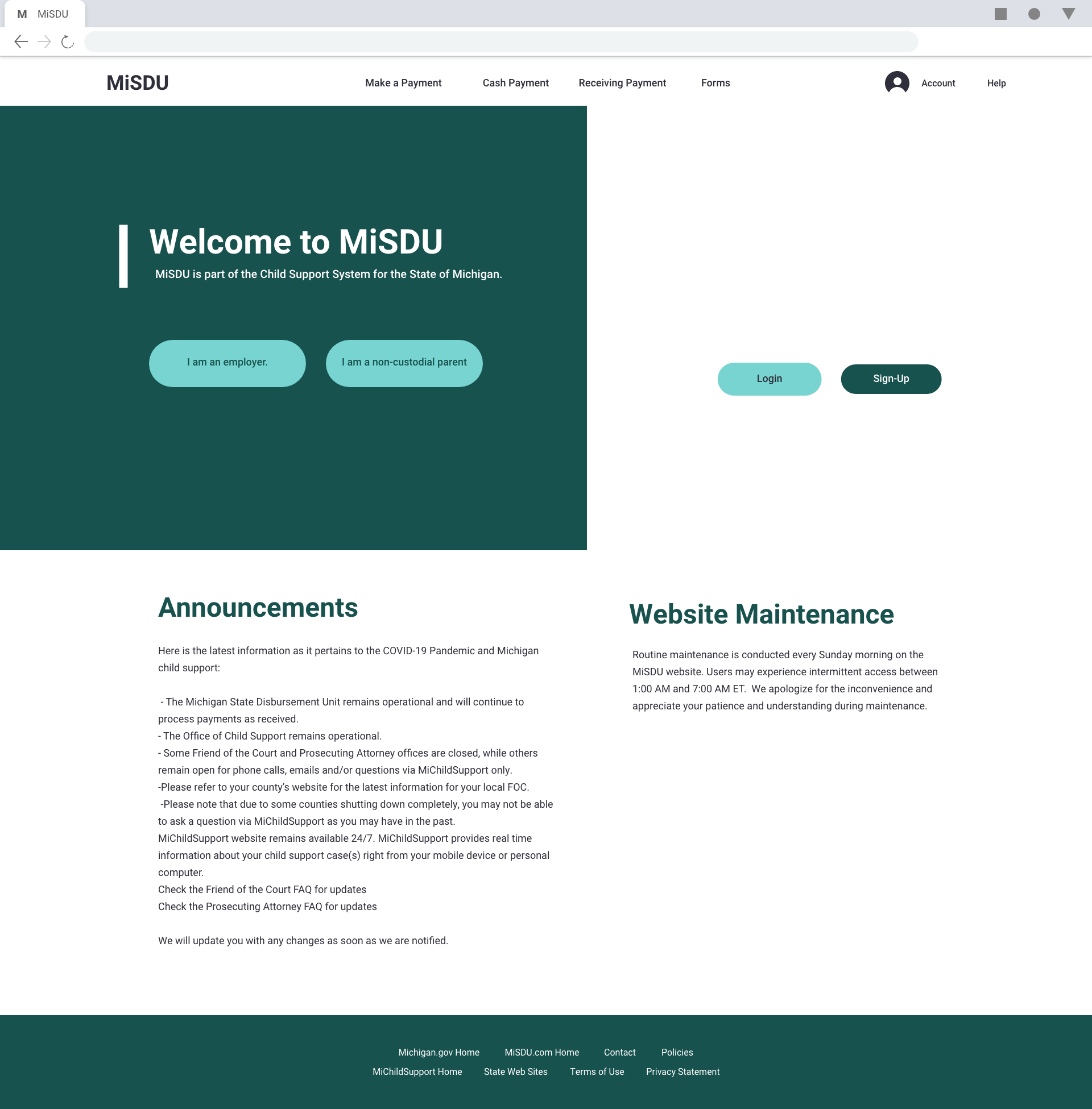
The look of the website for Michigan child support wasn't the only thing I had to take into consideration. At the time the stakeholders (State of Michigan & ExpertPay) were not sure of how they wanted the user to interact with the site and how the portal would lead to another website/service ExpertPay. As a result, I had to show 4 different scenarios for how this interaction could be achieved.
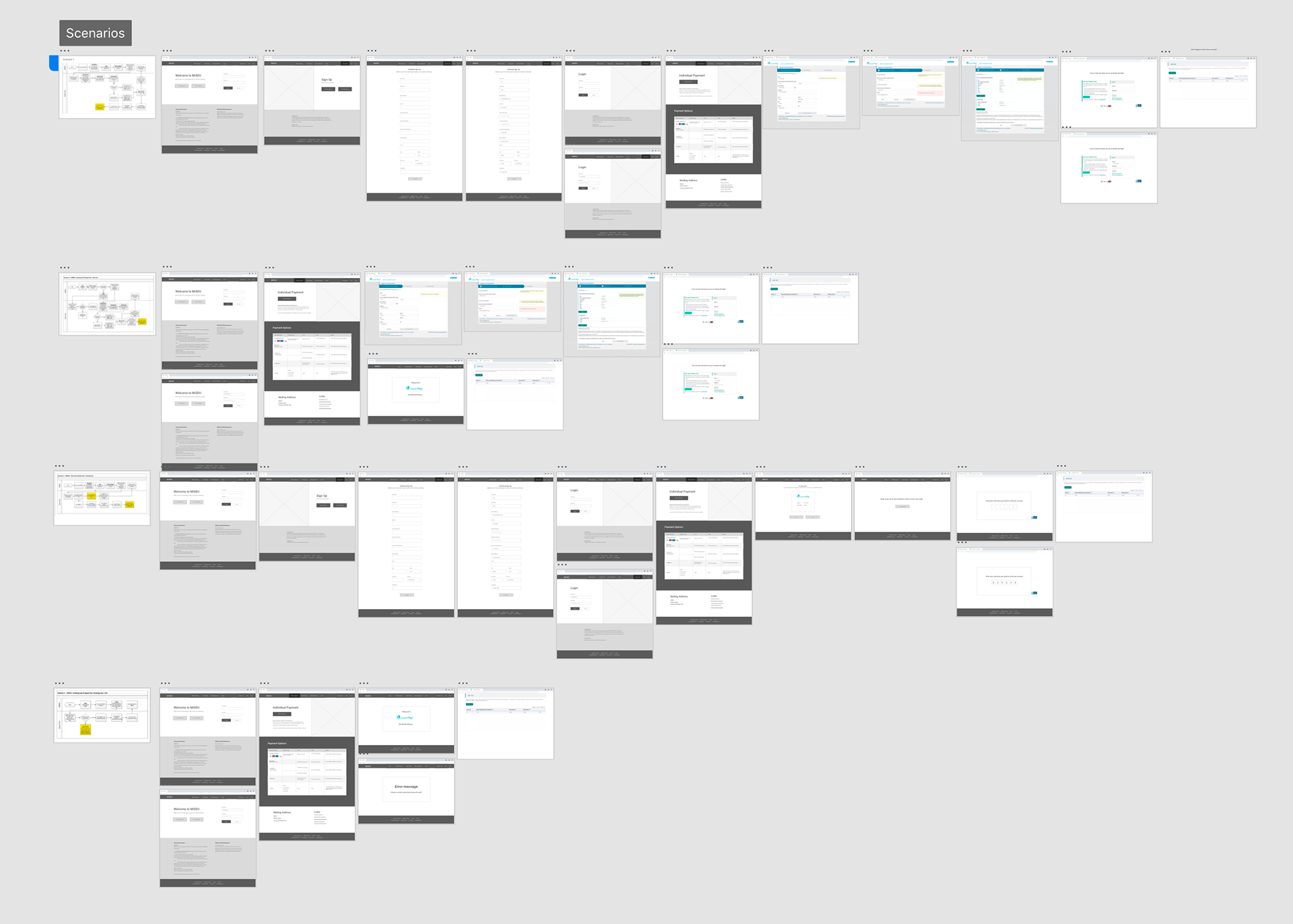
An overview of all the screen for each scenario.
Look & Feel
Once the pages and flows were finalized the next step was to add the "spice" to the design. A good user interaction is nice but, a crisp design takes it to the next level. Since the portal was part of the state of Michigan websites I wanted to incorporate the design language and style of their main website ( michigan.gov).
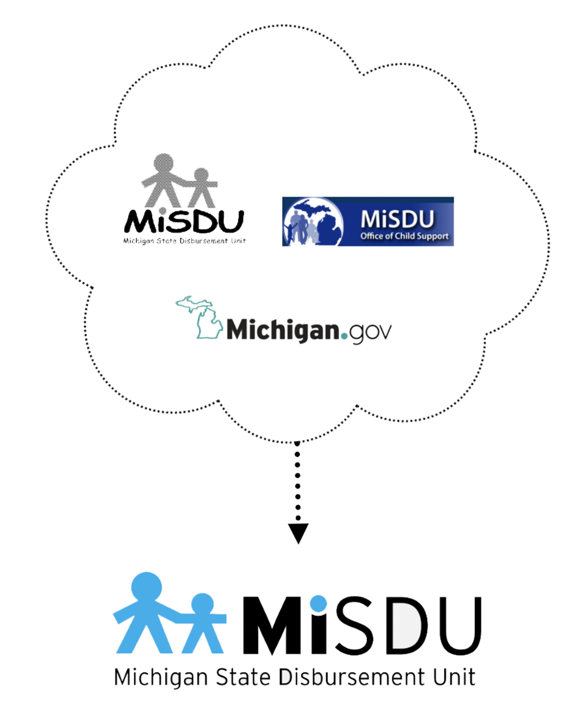
I decided to begin with the logo. The current website/system did not have a concrete logo or style (see above). I used the current logo and the Michigan.gov logo to create the new logo for MiSDU. The same elements were used but, were just modernized to match the direction the main website was taking.
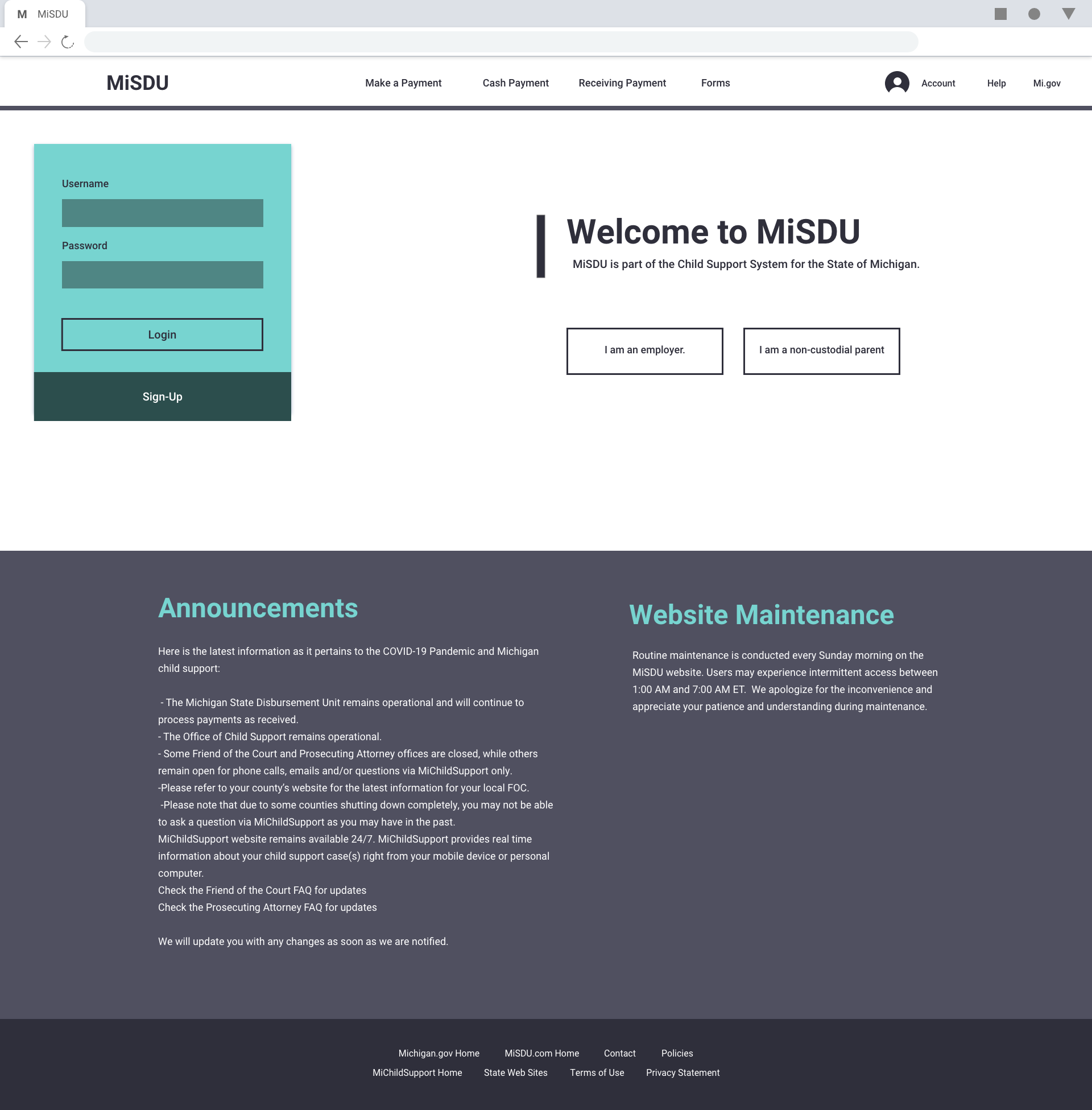

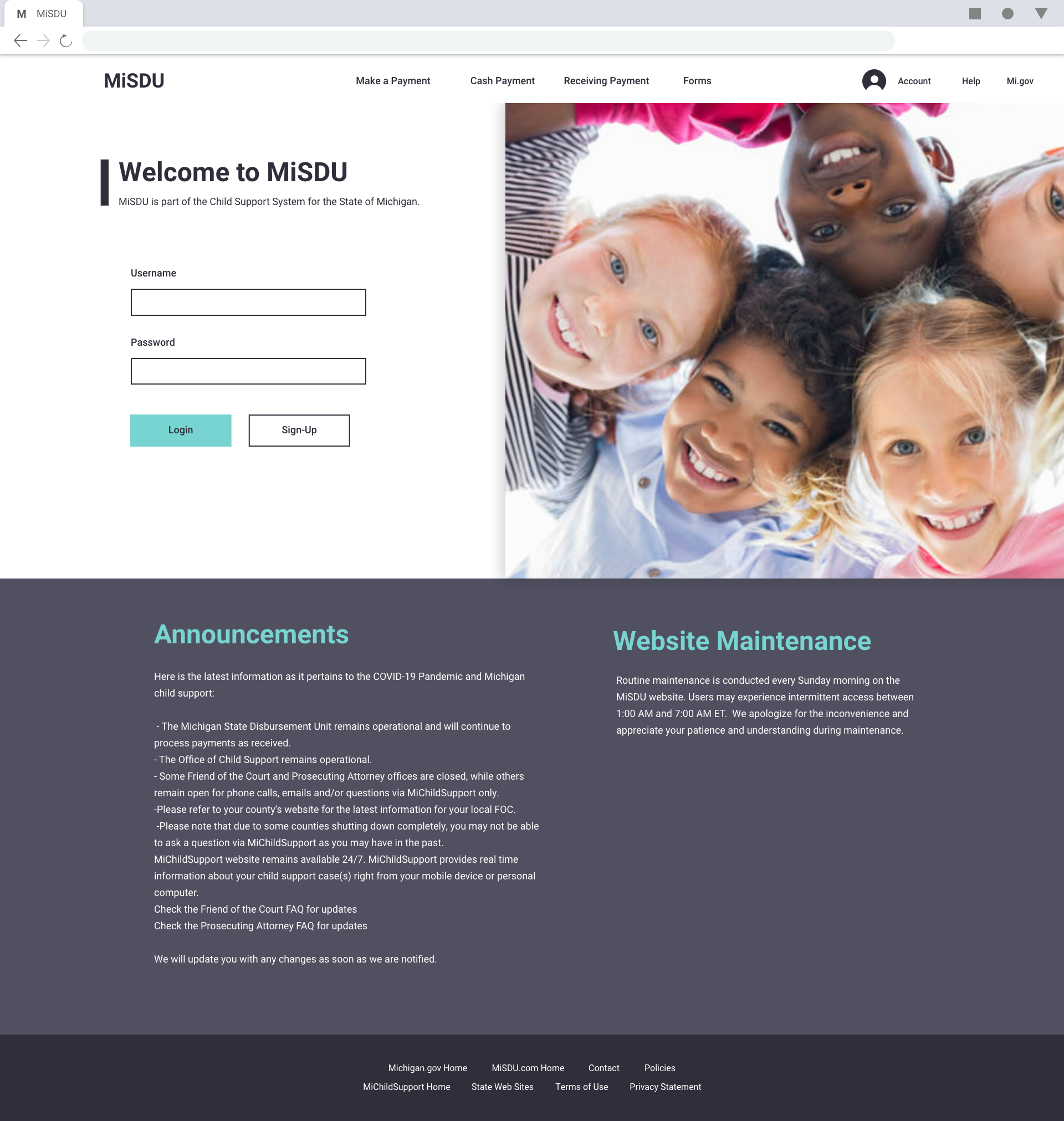
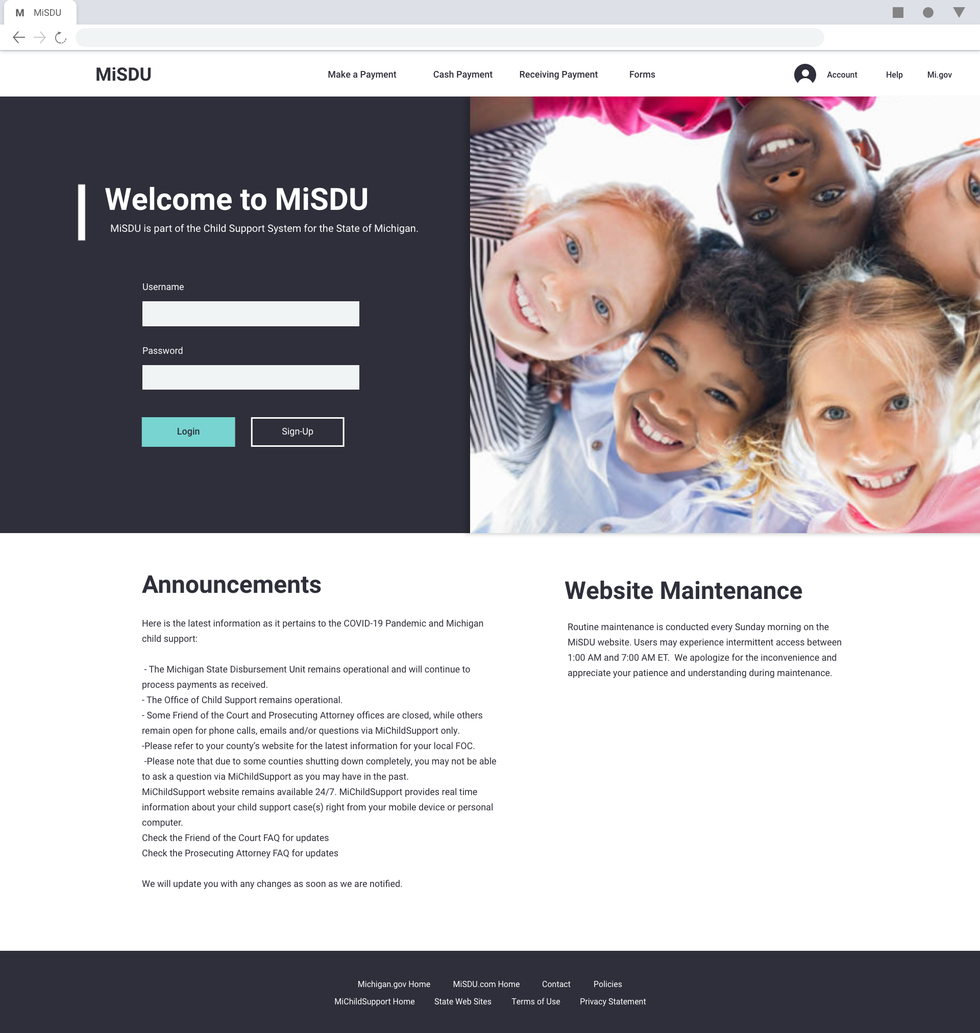

Using the new logo and current Michigan.gov website I started playing wit the color and the layout create the landing page and then branched out to the rest of the pages from there. And landed on the design below.
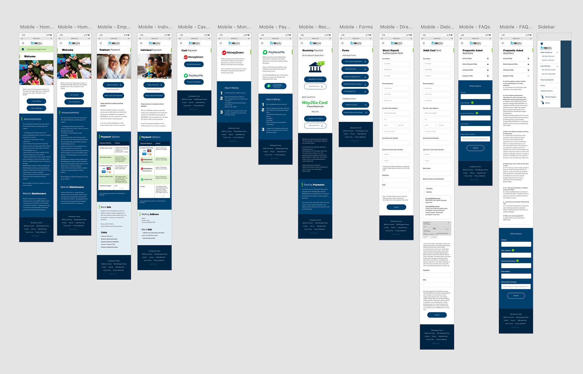
The last thing I created was the mobile version of the site. The app would work on mobile web. I adjusted the buttons and text to reflow on a smaller screen.
Next Steps
After the design is completed the work is still not done. Once the design was approved it was shared with back-end developers. I maintained a dialogue with the developers to make sure the the quality of the design was maintained throughout the development.