Clickable Maven Mobile Prototype
Key Screens
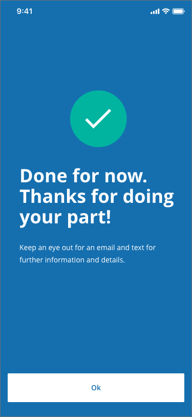

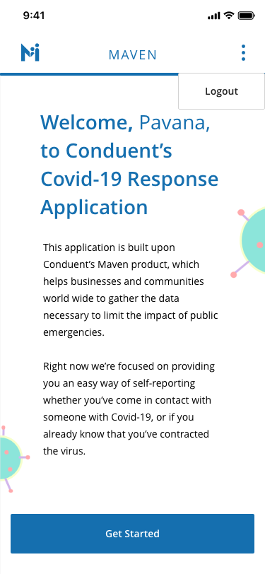
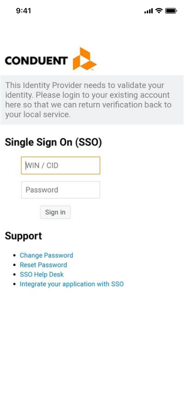
Far left: Splash Screen, Middle Left: Login, Middle Right: Home Page, Far Right: Survey Confirmation
High-Level User Flow Chart
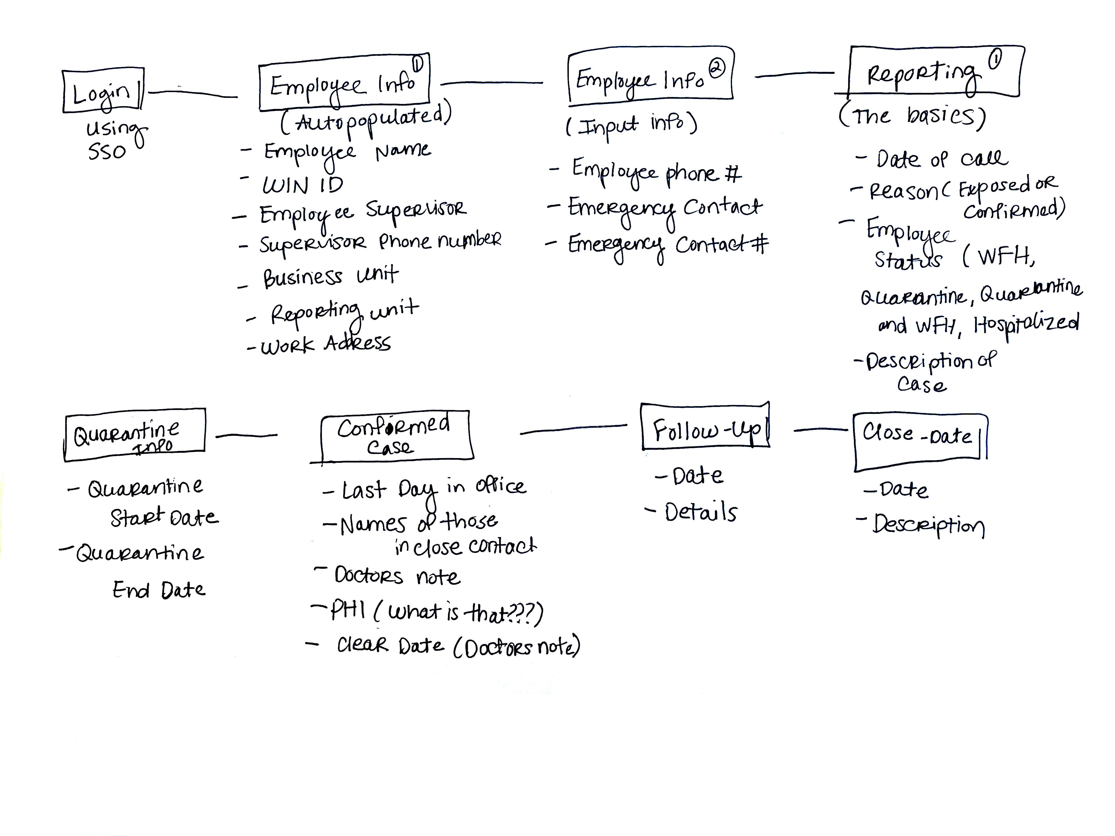
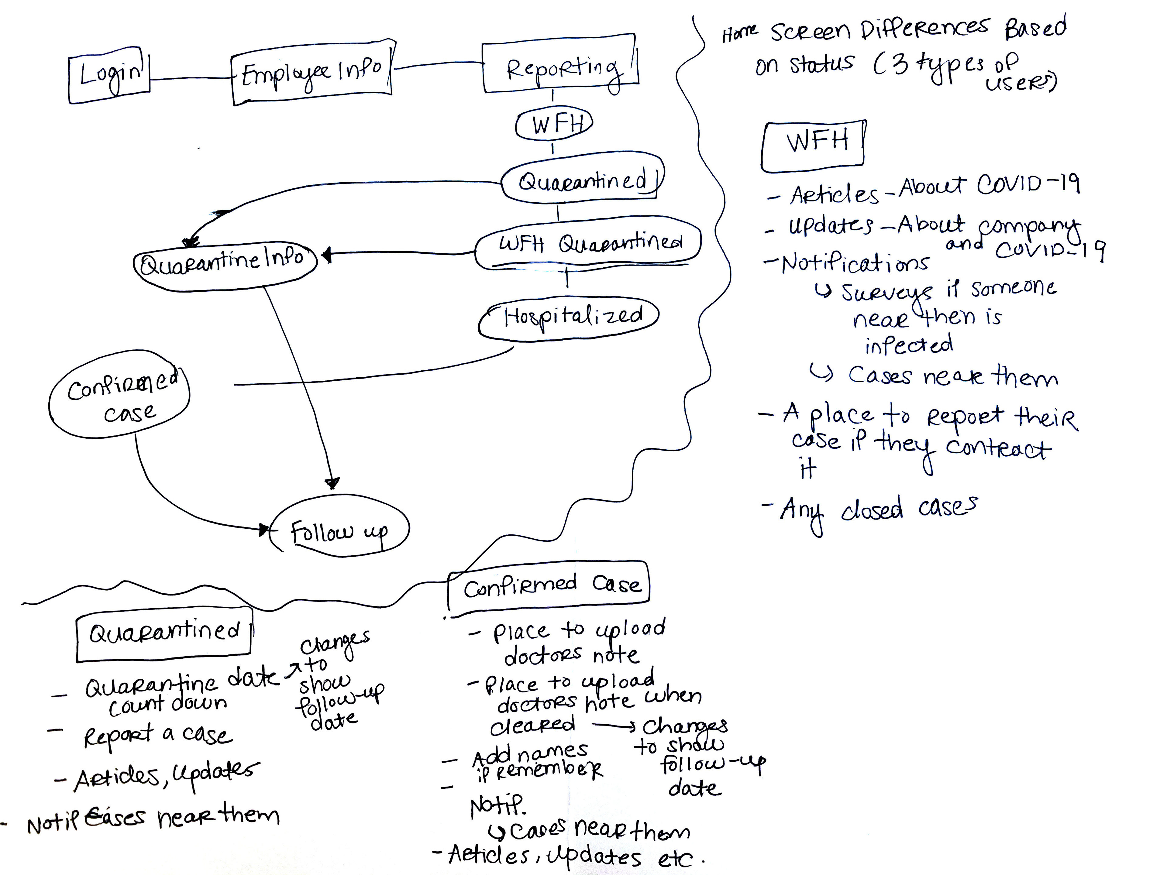
I created sketched maps of the content app on the left and the potential app flow on the right.
The next thing I did was take the necessary screens and figure out which screens were dependent on another to in order to inform the position of each screen in the overall flow.
High level wire frames for art boards.
More detailed wire frames for artboards.
After drawing out the wire frames it was time to move to the computer. In Adobe XD I made high-fidelity version of the wire frames to test if my logic for the flow made sense. The first wire-frames were built to be used as a native app.
After getting confirmation that the screens were good to go I then started going deeper into the wire-frames with more details.
The complete native version of the app.
Due to time constraints and funding the project pivoted toward a mobile web app with Bootstrap as a guide. As result a lot of the elements were changed and screens were removed.
Final Version of Maven made for mobile web.
What I Learned:
This project taught me that as a project moves along requirements change and it is important to stay agile and not get married to one concept. Being flexible is important because for the project to be successful you need to move at the speed of all of those involved. In addition, communication is paramount. If I didn't communicate with my teammates effectively this would have been a much harder task.
