High Fidelity Prototype Visit the App Store to see the official Tolls NY release!
Overview
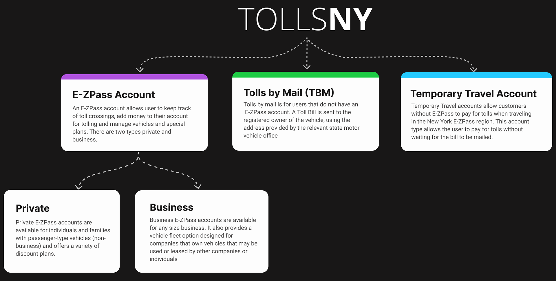
Tolls NY is a web platform that serves as a hub for managing E-ZPass accounts for people who frequent need to cross bridges and pay tolls have a transmitter in their car to track their crossings, the occasional user, that may only receive at Toll Bill after single use, and visitors that may need a pass for a short term visit of two weeks.
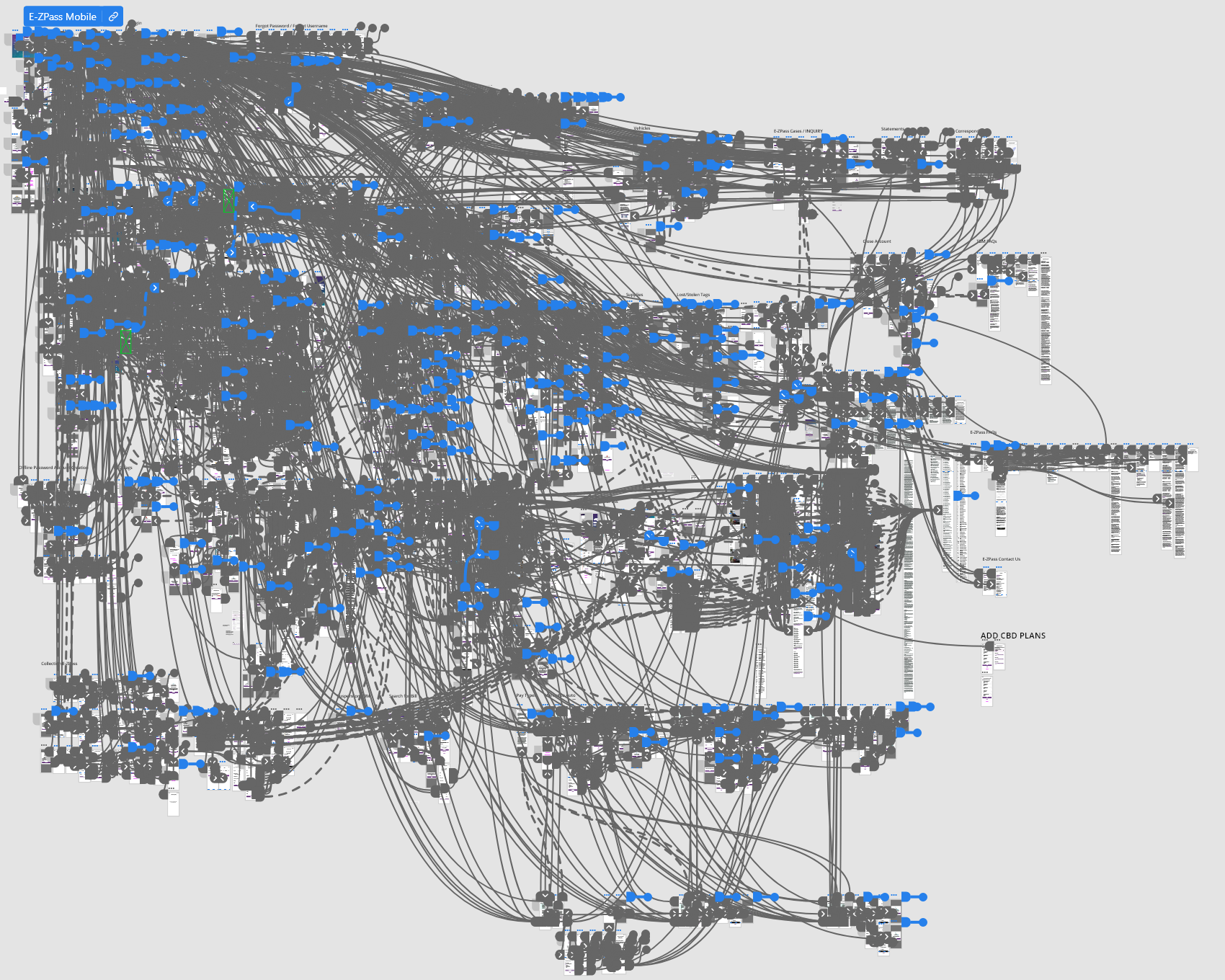
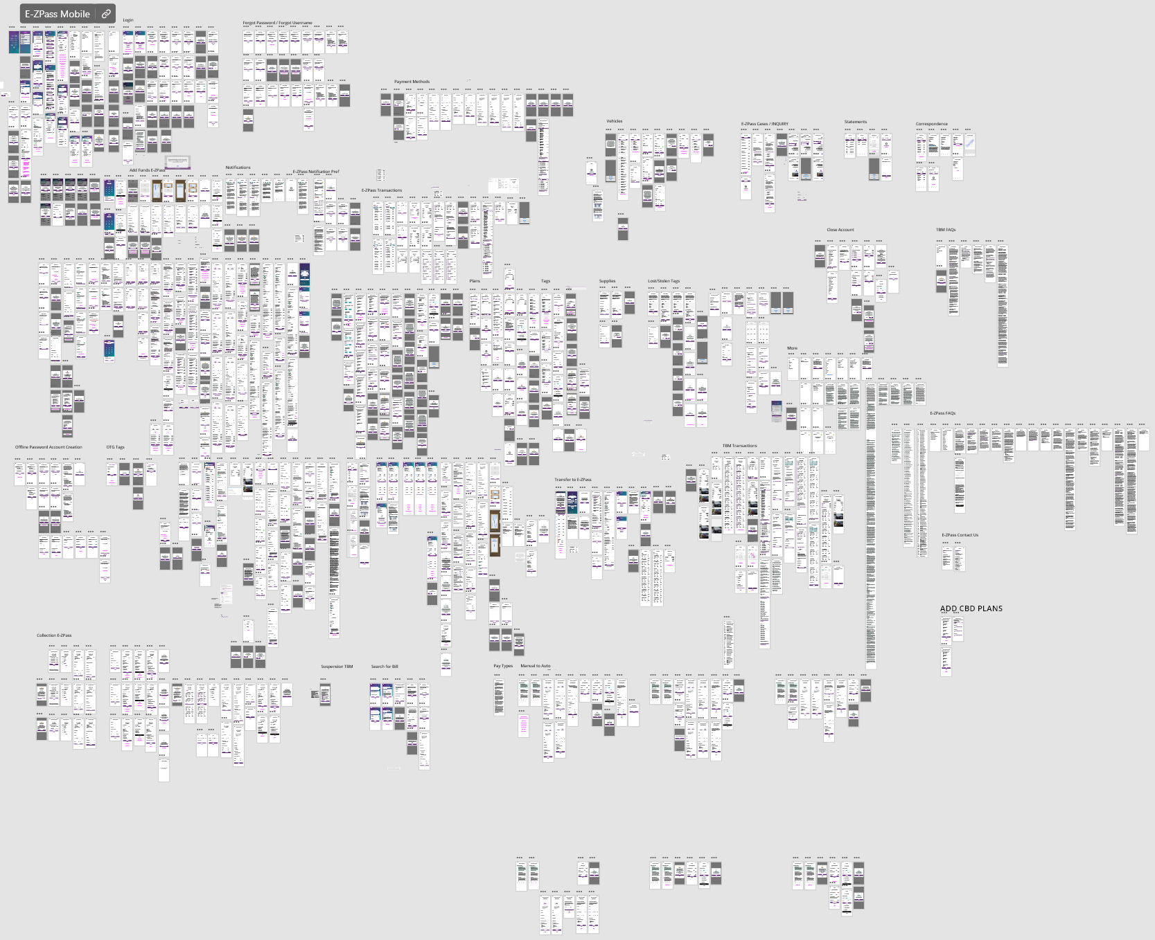
Eventually after completing all the screens and their iterations, edge cases, and error states the total was roughly 700+ screens over the course of 2+ years. The project was originally designed in Adobe XD then was transferred to Figma. Below is a diagram explaining the 3 parts of the Tolls NY app and their purposes.
User Flows
I created a website map with FigJam to organize all the parts of the app. Purple corresponds with E-ZPass, Blue with Tolls by Mail and Temporary Travel Account with green.
User Personas
This app was very large and complex. It was essentially 3 apps in 1. Each had their own dashboard, settings, and sign-up. There were 3 main groups of users that stood out commuters, occasional toll "crossers", and visitors. I created personas with needs based on each type of account: Temporary Travel Account, Tolls by Mail, and NY E-ZPass and illustrated the scenarios in how individual personas would make use of them.
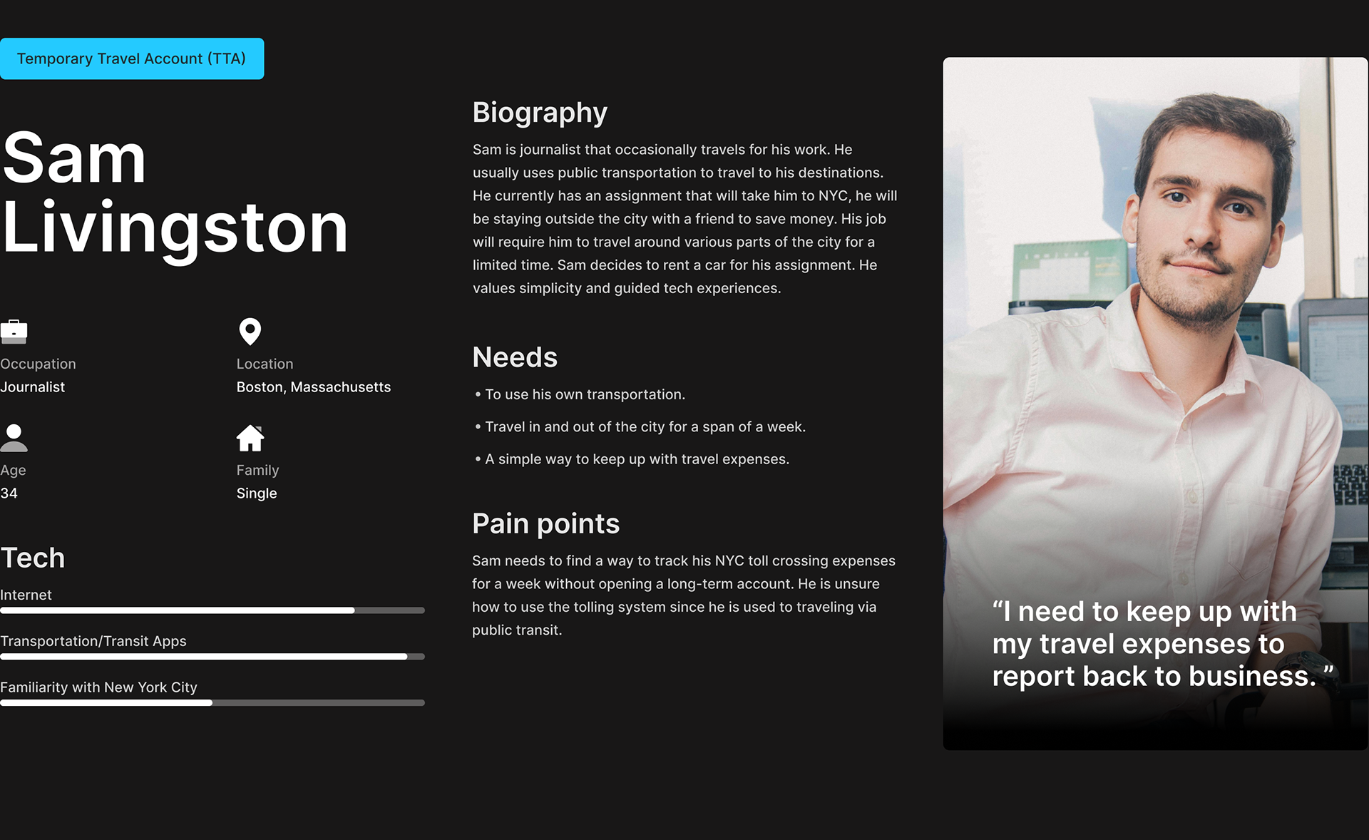
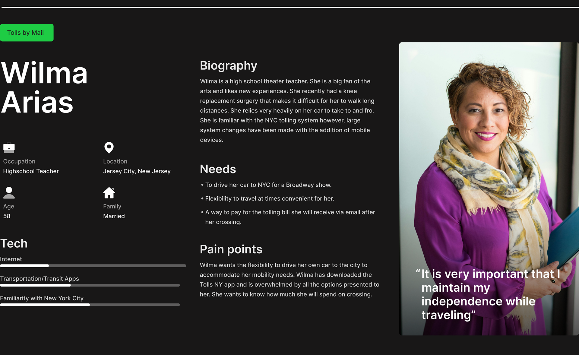
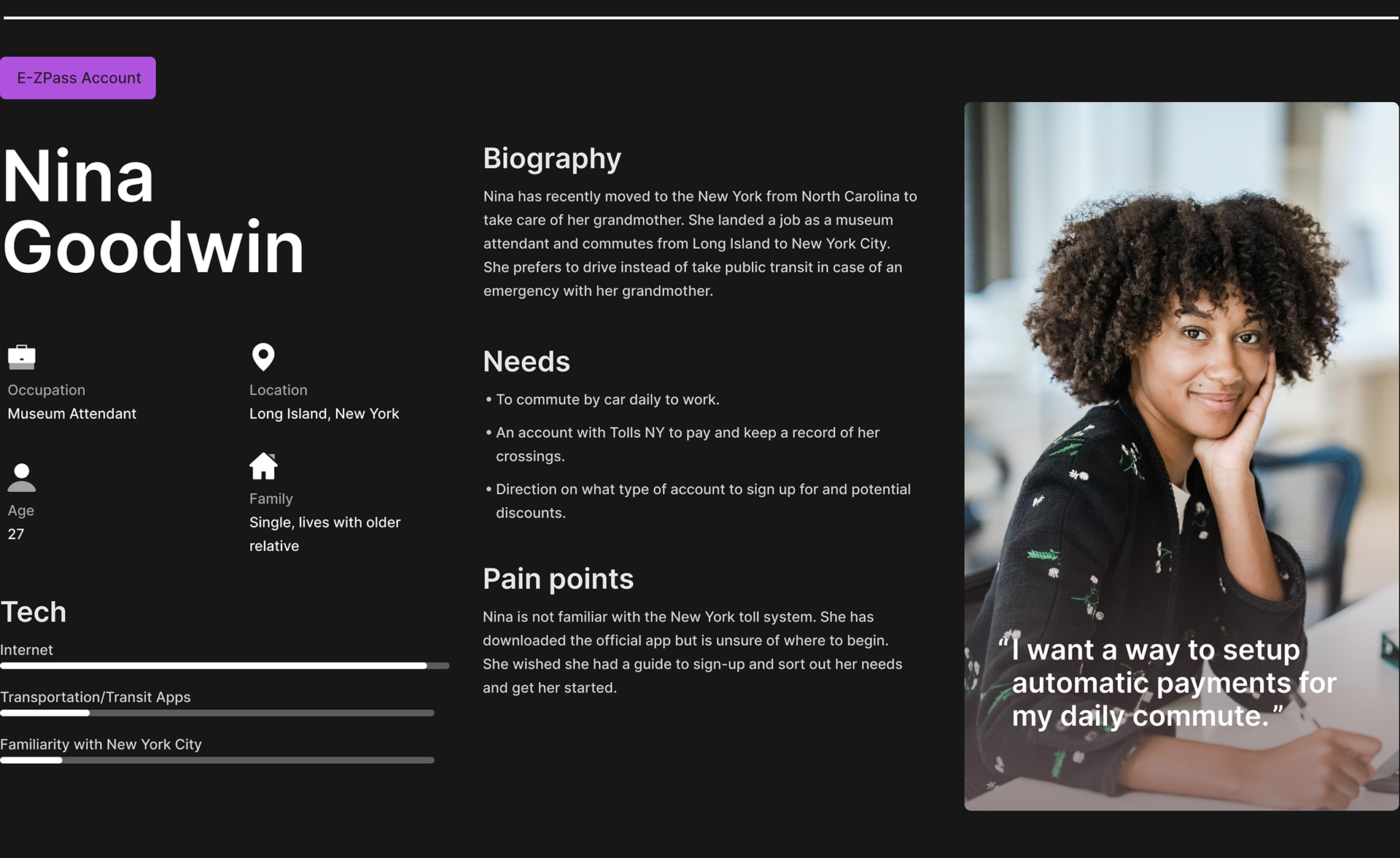
Each persona would go through their own unique experience of the app. Each of them all deep and robust. The largest focus and amount of time when creating the app went to the Sign-Up flow. I feel that Nina's journey through the sign up flow was is most important persona to represent to represent the challenges and wins of this app.
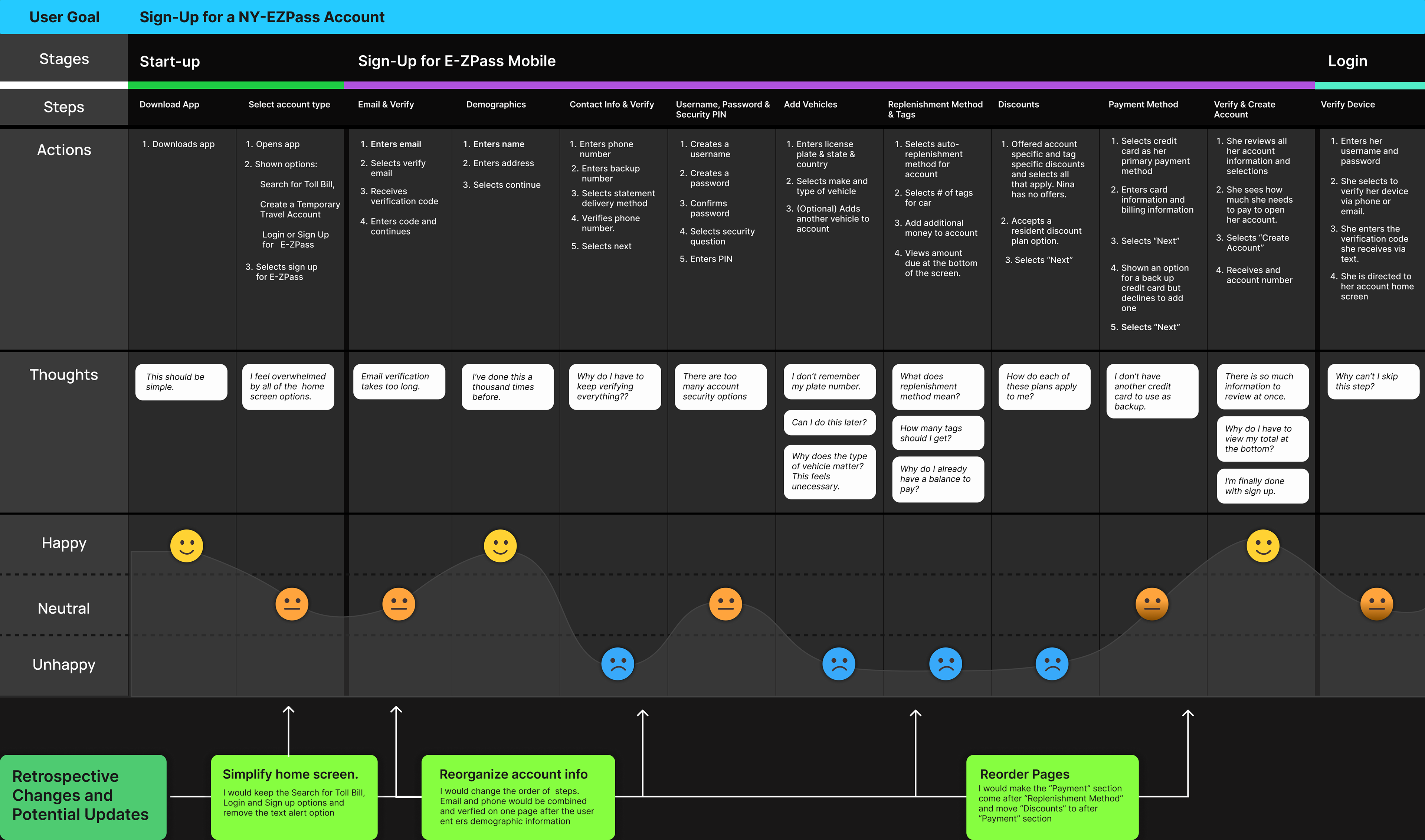
Below you can see Nina's user journey along with a couple of changes I would incorporate into the app without the constraints of time and a predetermined flow from stakeholders.
Nina's User Journey
Wire-frames
Post Development + Pre-Release
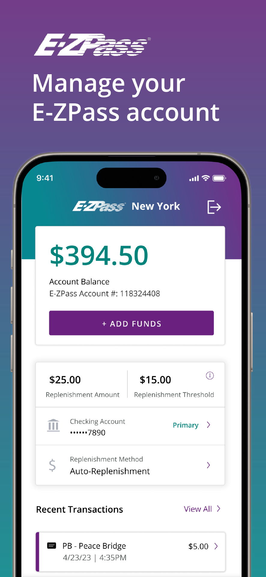
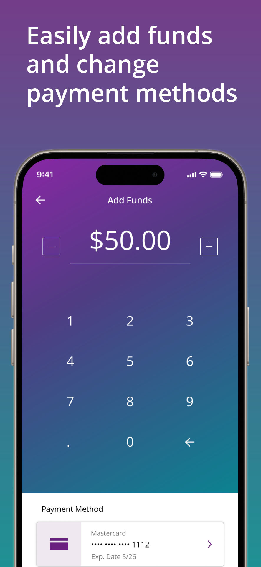
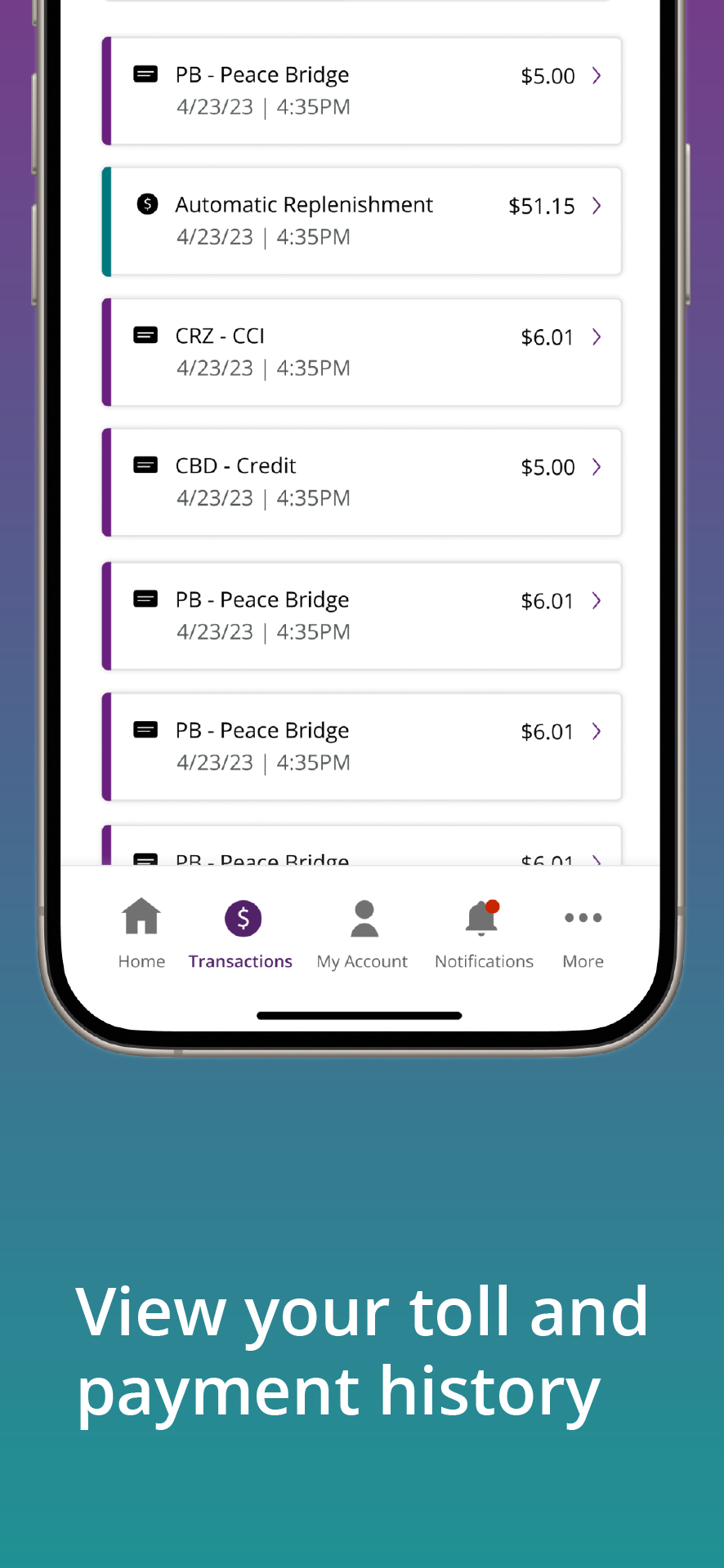
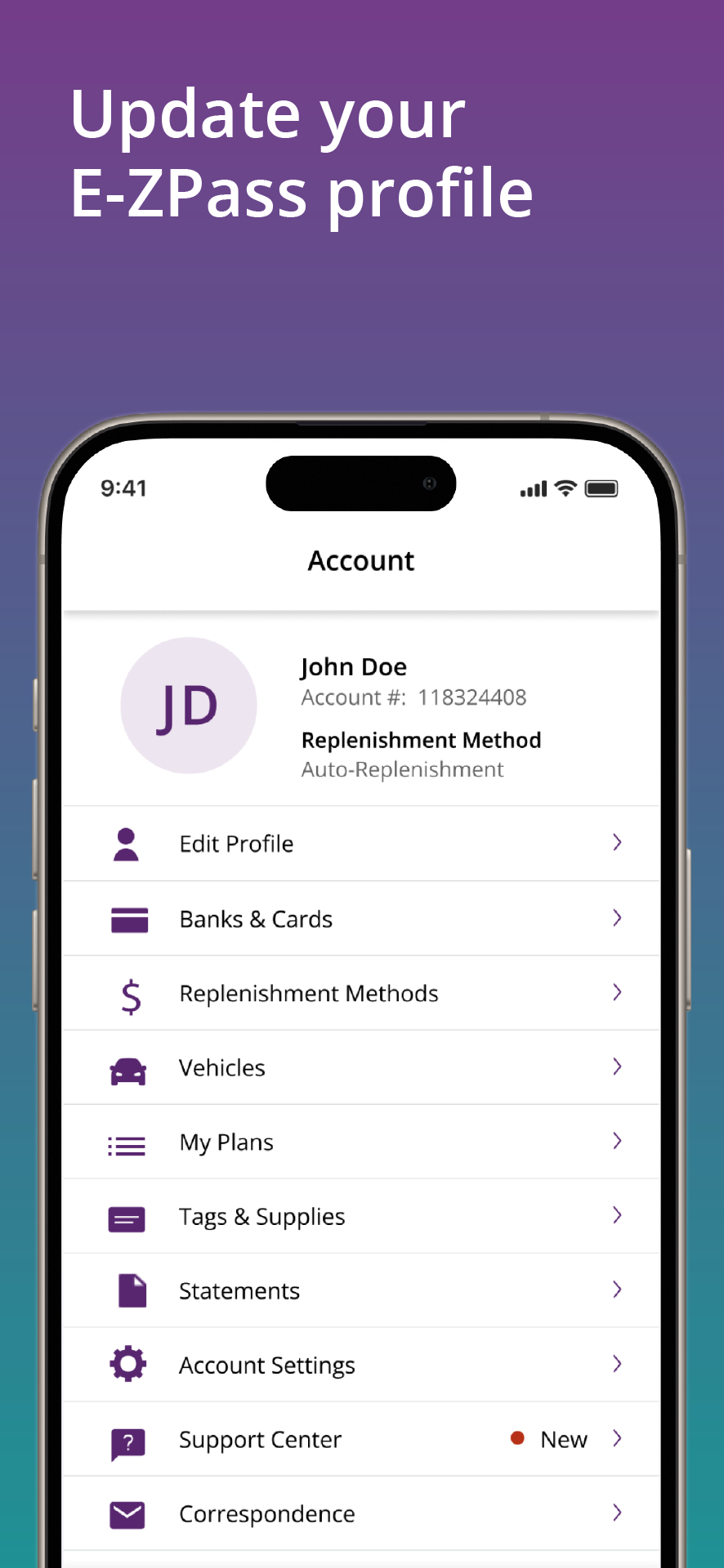
After the app was completed by the development team and passed QA. It was time to release it to the App Store and Google Play Store. I was then tasked with creating preview images for the app store postings.
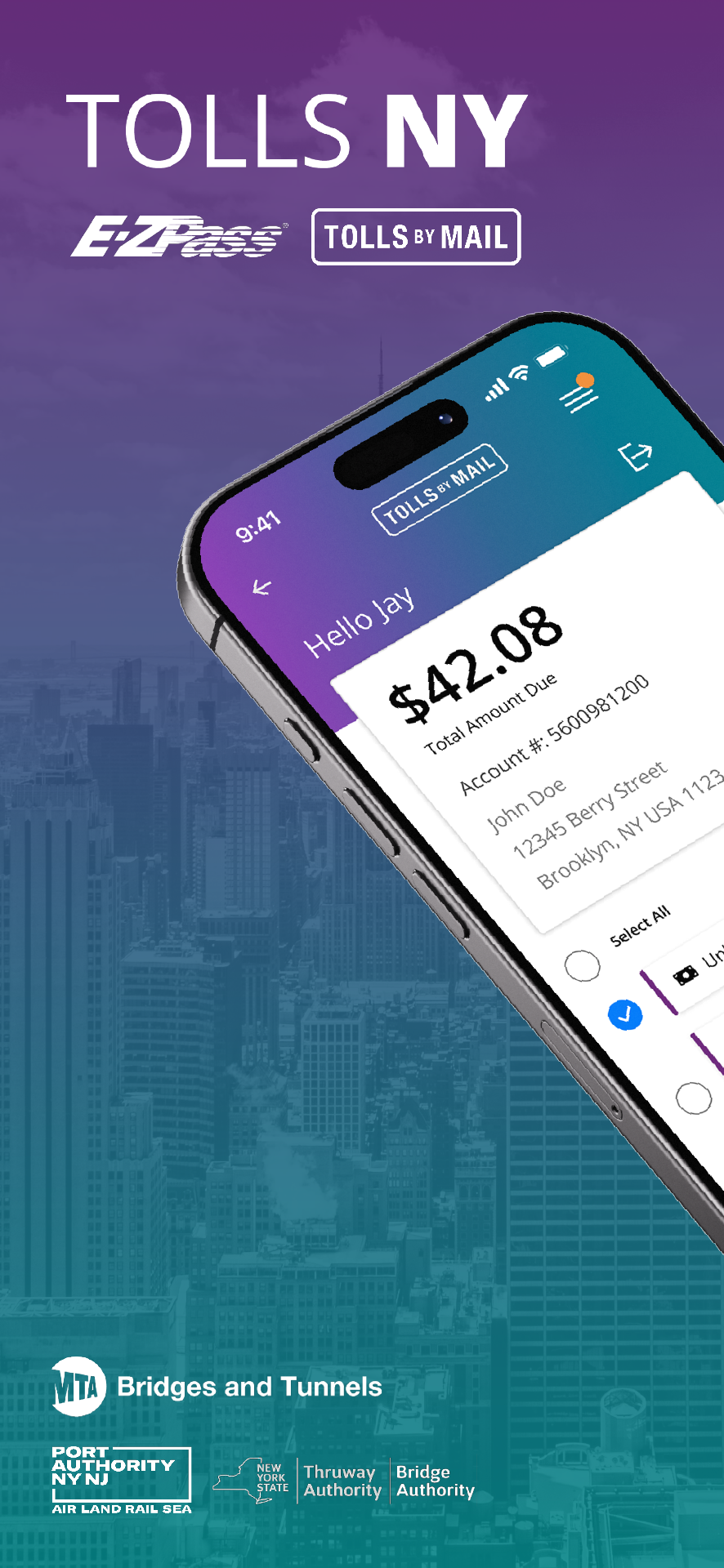
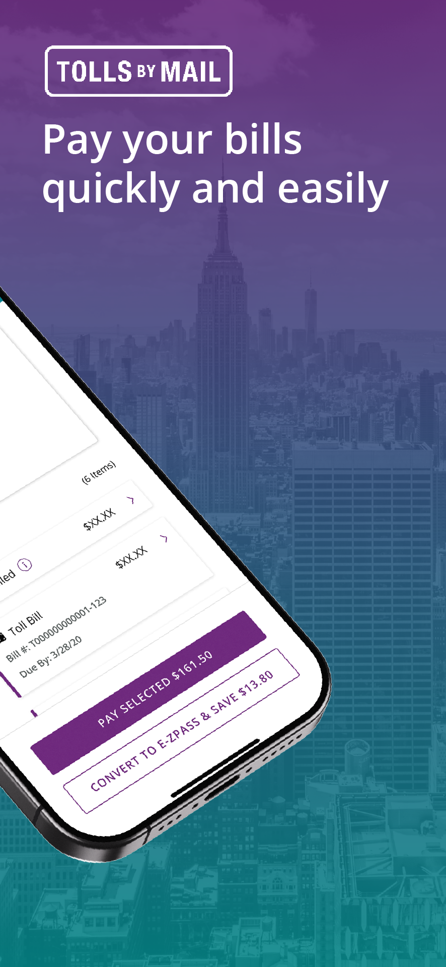
Over 200k+ Reviews with an average rating for 4.8 stars.
The app has received over all better app ratings with each update. Users mention they feel that the app is convenient and responsive and makes it easier to manage their payments and account details.
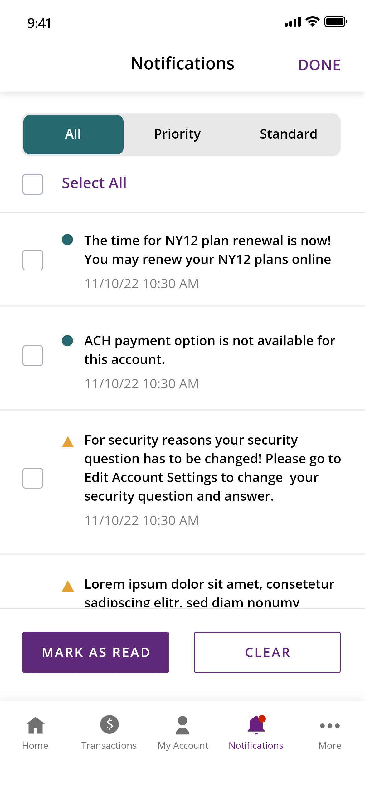
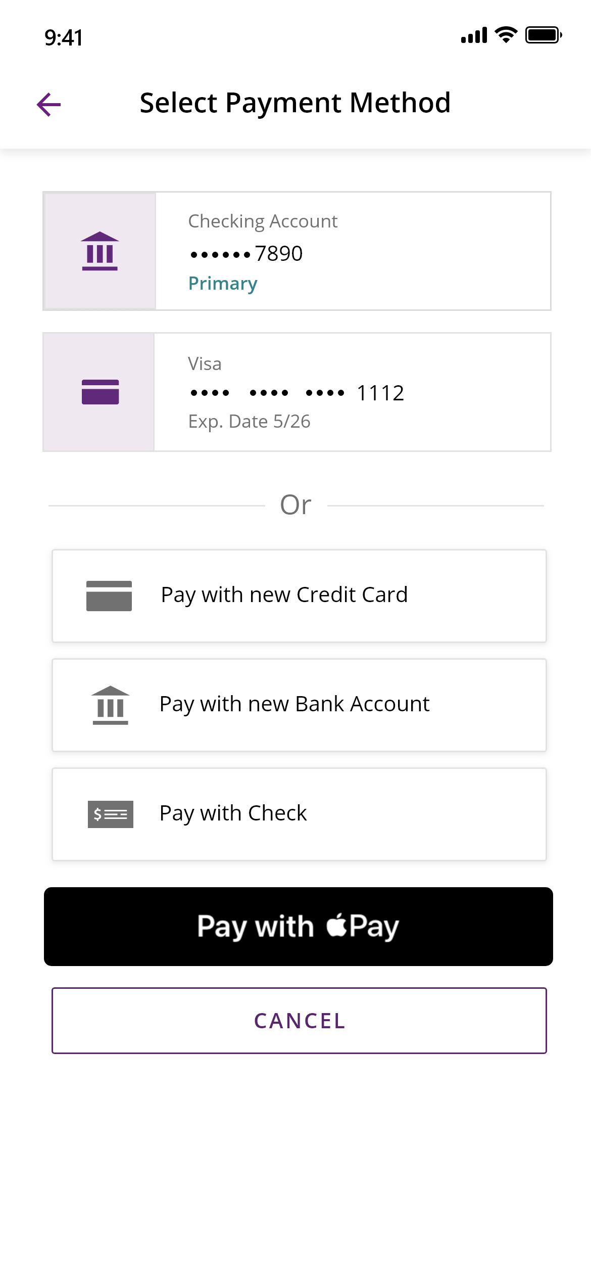
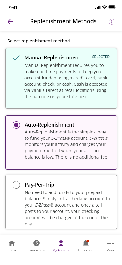
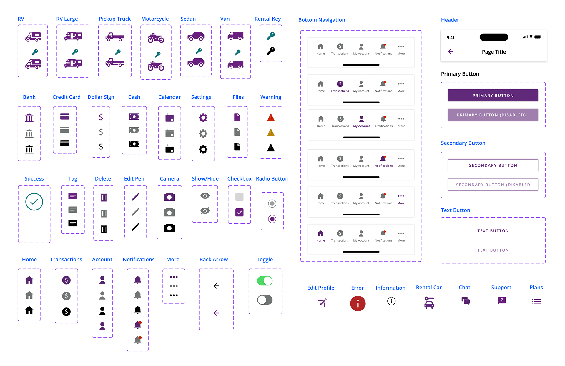
Interactive Components
Components were an integral part to this project. Building a library of components in Figma saved me crucial time and allowed me to be more efficient. Test out some of the components below!
Additional Icons and Components
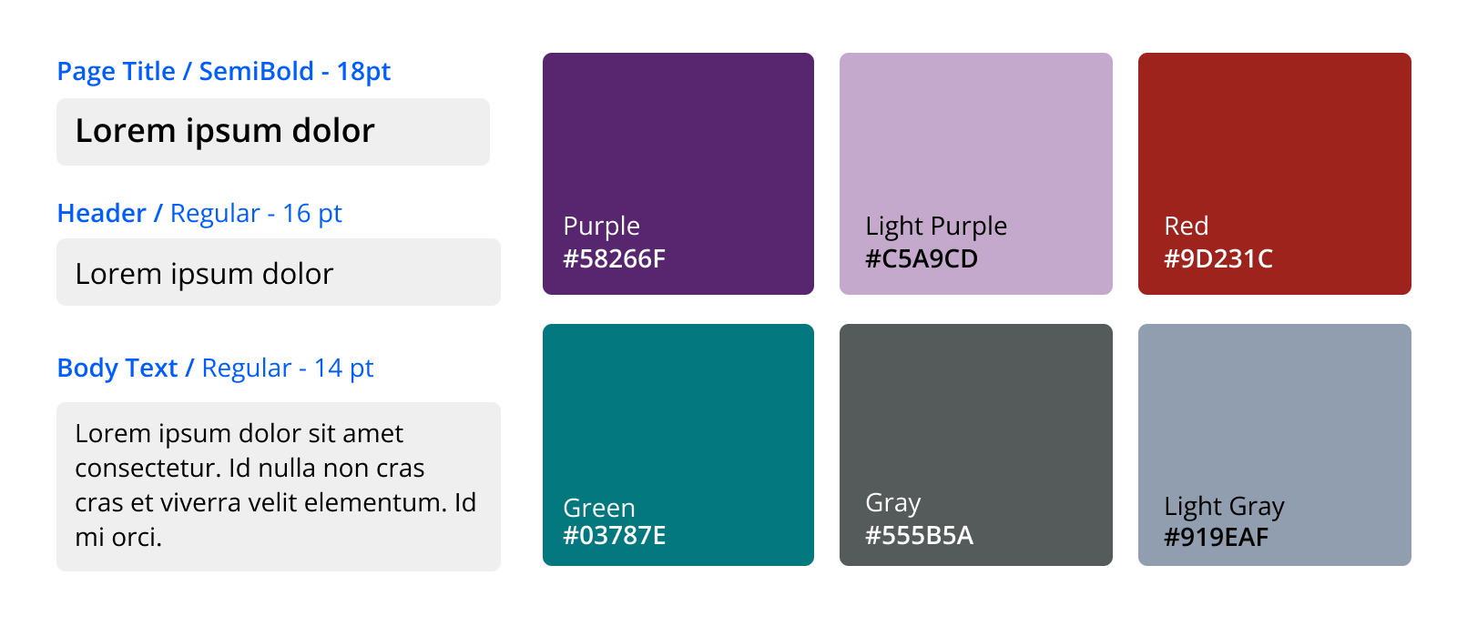
Basic Text and Color Palette
Screenshots